Triangular Composition in Art and How It Works
Three figures, or one figure and two supporting forms, usually make the triangle readable at a glance. The structure works because the eye can climb from a broad base to a single apex and feel held in place.
You've probably stood in front of a painting and sensed that upward pull before you had a name for it. A strong triangular composition in art does that. It gathers bodies, hands, drapery, light, and empty space into one stable shape.
Table of Contents
- Seeing the Triangle Before Naming It
- The Core Structure of Triangular Composition
- From Renaissance Form to Enduring Practice
- Balance, Focus, Stability, and Implied Lines
- Annotated Examples Across Art History
- Building and Evaluating a Triangular Composition
- Triangular Structure in the ARTIST6 Visual Grammar
- Why the Device Still Matters
Seeing the Triangle Before Naming It
A visitor steps close to an altarpiece and doesn't start with theory. The first thing that happens is visual. The eye lands on the lower figures, then follows the diagonal pull of shoulders, arms, and folds of cloth until it reaches the head or halo at the top.
That path feels earned by looking. The base carries the weight. The sides rise with less effort, but they still matter because they keep the gaze from spilling outward. When the apex arrives, the viewer understands where the painting wants attention to settle.
A museum viewing habit
This is why triangular composition often feels familiar even when the viewer has never heard the term. The structure can be built from people, but it can also come from architecture, a beam of light, or the angle of two turned heads. In Renaissance devotional painting, that logic helped artists hold several figures together while still leading the eye toward one central subject, often a Madonna or a holy figure, in a coherent unit (University of Chicago Press reference).
The triangle doesn't announce itself. It becomes visible when the eye notices how the image keeps returning to one upper point.
That upward movement matters because it gives the composition a clear order. The lower edge feels grounded, the middle zone feels active, and the top feels reserved for emphasis. Even when the shapes are implied rather than drawn, the viewer usually senses the same three-part structure.
The Core Structure of Triangular Composition
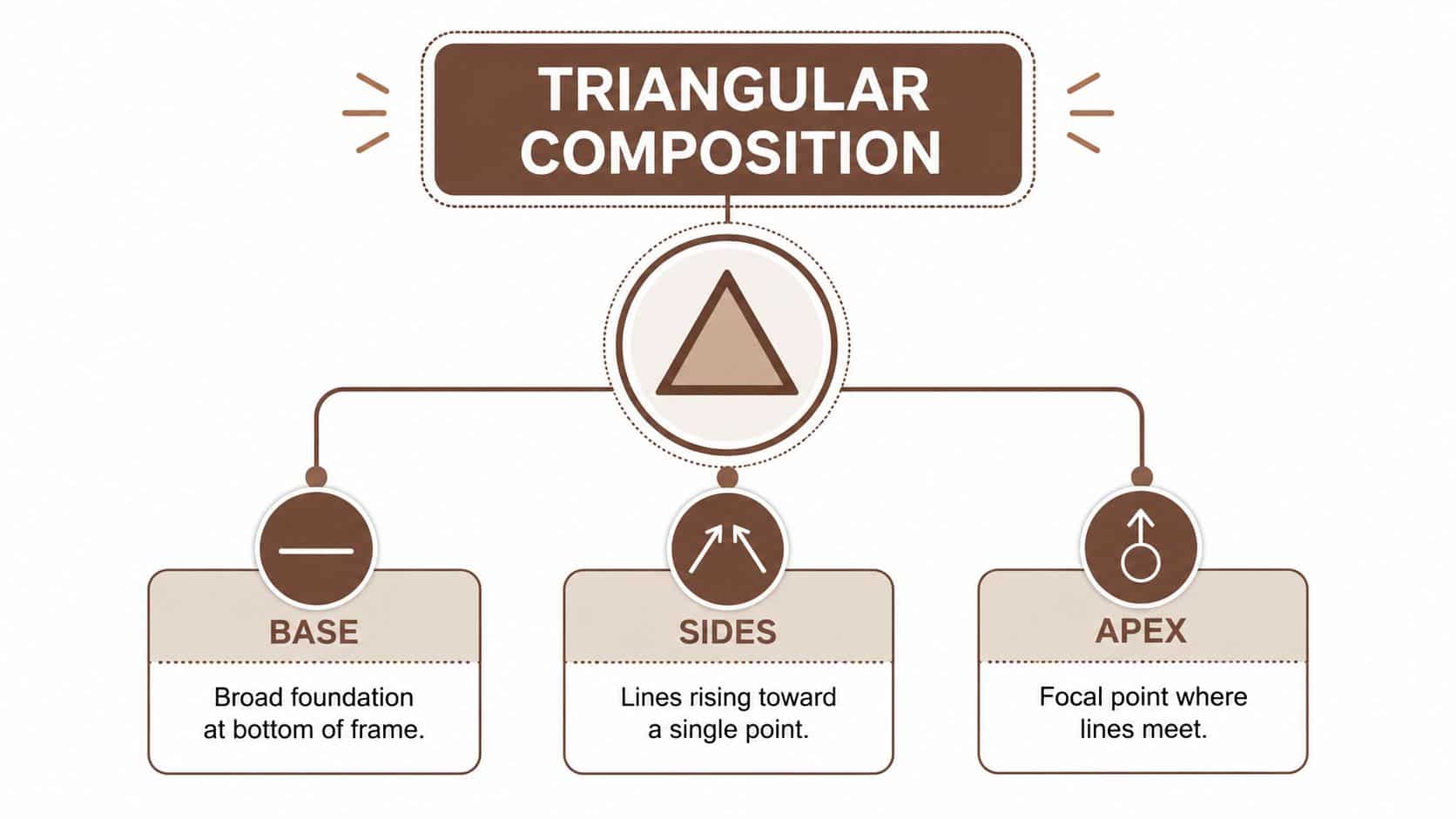
A triangular composition in art is simple in outline, but it has a clear internal grammar. Think of a picture plane with a broad base near the bottom, two sides rising toward one point, and a single apex near the top. The eye moves along that frame, and the whole image stays organized around the same route.
Literal shape and implied shape
The triangle can be literal. A roof line, a pediment, or a pyramid gives the viewer the shape directly. More often, it is implied. Artists make the form out of figure groups, gaze direction, angled arms, folded knees, architectural edges, or even a band of light.
The base is the anchoring zone. It usually holds the heaviest visual information, the seated figures, paired objects, or the lowest cluster of forms. The sides do the connective work. They rise from the base and guide the eye toward the apex, which usually carries the most important figure or focal point.
Why the structure feels readable
This structure matters because it is closed. The three sides create a visual field that keeps attention inside the frame instead of letting it drift away. In teaching sources, triangular and pyramidal arrangements are often contrasted with the rule of thirds, which divides a picture into 9 equal parts, but the triangle offers a different kind of hierarchy, one built on convergence rather than a grid (ArtProf).
The triangle also helps explain why some paintings feel calm even when they hold many figures. The base supports the upper point, and that relationship gives the whole image a sense of order. When artists want more tension, they often loosen the symmetry, tilt the apex, or shift the triangle slightly off center.
From Renaissance Form to Enduring Practice
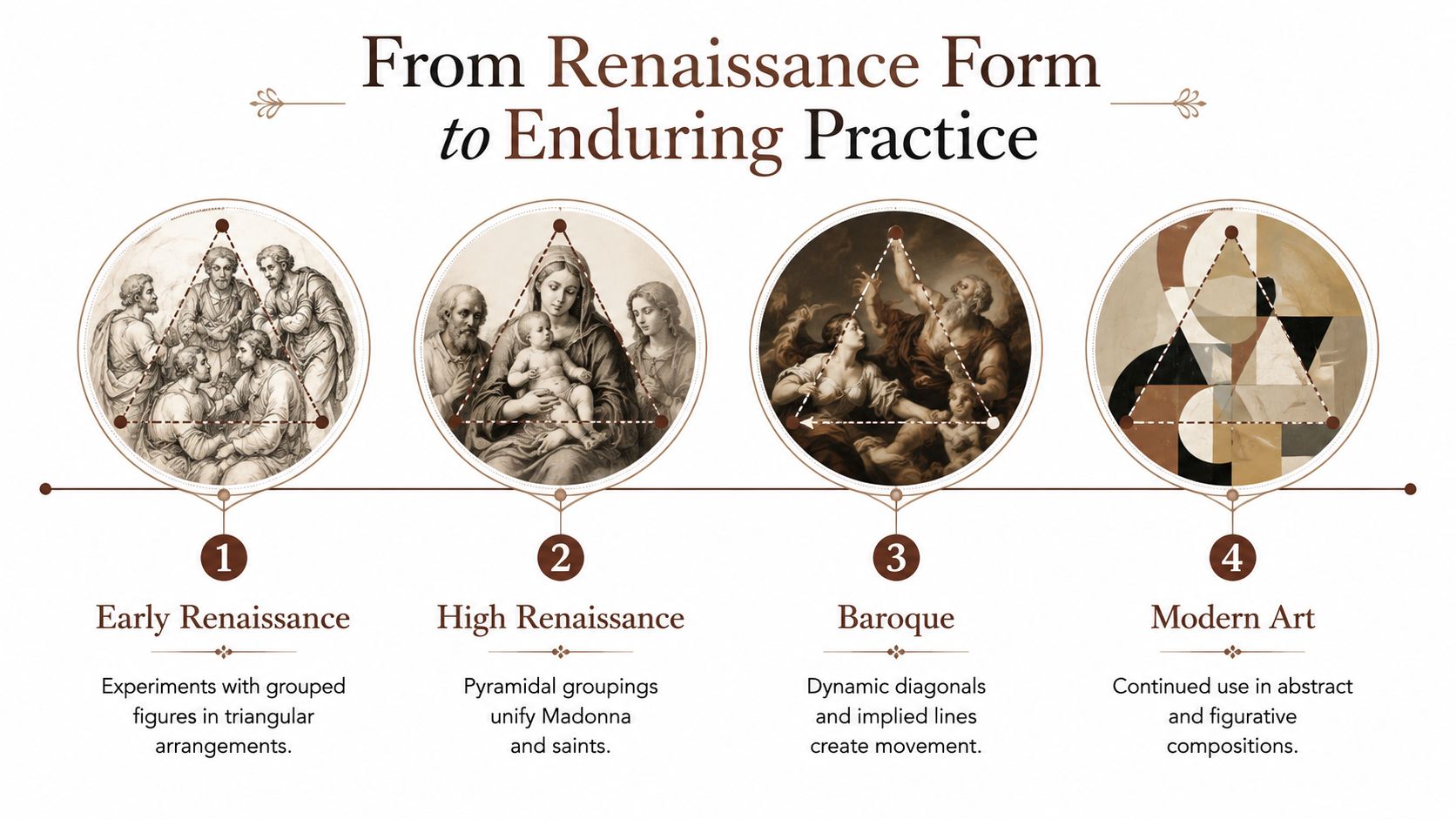
A triangular composition often reads like a small scaffold for the image. One point lifts the eye, two lower points keep it grounded, and the whole structure lets separate figures feel like part of one scene. Renaissance painters used that logic to organize religious subjects around clarity and calm. Art-history sources describe that period as one where figures were frequently arranged in triangular groupings, and where perspective was sometimes explained through a triangular theory of vision, as discussed in the University of Chicago Press reference. The idea was practical as well as symbolic.
Why it stayed useful
In Madonna and Holy Family images, the triangle solved a common problem. Several figures had to share one pictorial space without splitting attention in too many directions. The apex could hold the principal figure, while companions formed the base and the sloping sides. That pyramidal arrangement gave the scene balance, harmony, and stability in classical religious art.
The same structure remained useful even as style changed. Baroque painters steepened or broke the triangle to increase motion. Neoclassical painters often returned to quieter, more even arrangements. In the nineteenth century, elements such as hills, trees, or shafts of light could take over the structural role once held by saints and devotees. The underlying job stayed the same, giving the eye a clear point of emphasis inside a stable frame.
That continuity is visible across later figurative work, including artists such as Leonardo da Vinci, Raphael, Michelangelo, and Caspar David Friedrich, where triangular and pyramidal structures recur across centuries (ArtProf). Seen this way, the triangle is not a frozen period formula. It is a working method that artists still adapt in studio practice.
Contemporary Renaissance art and its visual grammar shows how that older logic can still carry forward without imitation.
For artists building or evaluating a composition, the useful question is not whether the triangle is present in name. It is whether the eye can trace the major masses, find the apex, and read the supporting base without confusion. Collectors respond to that same coherence. In fixed-edition work, a clear visual grammar helps a piece hold together across repeated viewings, because the structure remains legible even when the subject matter changes.
Balance, Focus, Stability, and Implied Lines
A triangular arrangement works like a set of joined supports in a small structure. The lower parts carry weight, the slanted sides guide movement, and the upper point gives the eye a place to settle. The shape feels calm because those forces point in the same direction, even when the image itself is busy.
The four pressures inside the shape
Balance comes from weight distribution. A broad base can hold a seated figure, a pair of heads, or a cluster of objects while lighter forms rise above them. The triangle does not need to be perfectly even. A slightly asymmetrical version can still hold if a stronger mass on one side is matched by a clear counterweight on the other.
Focus comes from the apex. The viewer reads that upper point as the main node when gaze lines, hands, or angled shoulders lead toward it. In devotional painting, that helps the eye settle on a single place without confusion.
Stability belongs to the base. A wide lower section steadies the image and keeps the form from feeling like it might tip. Some artists use the opposite effect on purpose. A leaning apex or a skewed triangle can make the scene feel unsettled.
Practical rule: if the triangle feels vague, trace the invisible lines between heads, hands, and objects before changing the drawing.
Implied lines carry much of the structure. They are not drawn on the surface. They arise from one figure looking toward another, the angle of a forearm, the edge of a table, or the gap of negative space between forms. In practice, artists often test this with chiaroscuro and related methods, where tone helps the eye read the structure alongside the contour. Triangular structure in Renaissance chiaroscuro and related methods is a useful reference for that overlap.
For a more technical visual framework, the golden triangle divides the frame with one main diagonal and two perpendicular lines from the opposite corners, giving artists a measurable way to place diagonal force and subordinate masses (German Wikipedia entry on triangle composition, Golden triangle composition)).
A final distinction helps. Harmonious triangles are often described as isosceles or equilateral. Skewed triangles feel less stable and more emotionally charged (German Wikipedia entry on triangle composition). That gives artists a choice in emphasis, not a rule to obey.
Annotated Examples Across Art History
A triangular composition often becomes easiest to read when you slow the eye down and ask a few simple questions. Where does the shape point? What carries the weight at the bottom? Which lines guide attention upward? That way of looking makes very different works easier to compare without forcing them into the same formula.
| Work | Apex | Base | Internal Sightlines | Focal Emphasis | Effect |
|---|---|---|---|---|---|
| Renaissance altarpiece | Upper holy figure or haloed head | Lower cluster of attendants or donors | Raised hands, angled shoulders, converging glances | Central devotional subject | Stable, ordered, reverent |
| Baroque portrait | Head or lifted hand | Broad seated body or grouped garments | Diagonal arm, turned torso, eye contact | Face and gesture | More psychological, less still |
| Nineteenth-century landscape | Peak, tree crown, or bright sky point | Sloping ground or tree line | Ridgelines and cloud movement | Distant summit or light source | Spacious, atmospheric, directed |
| Figurative photograph | Standing figure or upper head position | Seated or grouped lower bodies | Body turns, gaze chains, empty intervals | Person at the top point | Controlled, modern, quiet |
| Mixed-media work | Highest visual density or shape cluster | Wider lower field of materials | Layer edges, repeated diagonals, cut paper gaps | Compositional node | Structured complexity |
Reading the examples
The Renaissance altarpiece usually offers the clearest sacred version of the form. The apex sits high, the base is crowded, and the image feels held together by a logic that is both visual and theological. The structure is legible because the viewer can trace how figures, hands, and glances rise toward a single point. In this period, the triangular arrangement is not just a compositional habit, it is part of a shared visual grammar, something the ARTIST6 reference archive also treats as a recurring way of organizing attention across works and editions.
The Baroque portrait keeps that same basic shape but lets it move more freely. A head, a hand, and a torso still form the triangle, yet the effect is more dramatic than calm. The body turns, the gesture interrupts stillness, and the eye follows those shifts before settling on the face.
Landscape uses the same logic without relying on figures. A ridge line can form the base, a peak can become the apex, and clouds or trees can serve as the side lines. The scene reads as organized because the major forms rise toward one point, even when the subject is open air rather than a human group.
Photographs often handle the structure more subtly. Bodies, chairs, and empty space can arrange themselves around a dominant point without announcing the triangle outright. The viewer senses the order through posture, spacing, and the direction of attention.
Mixed-media work can make the structure feel denser. Layer edges, repeated diagonals, and cut paper gaps may produce a compositional node at the top or near it, while the lower field carries the weight. The triangle still helps, but here it acts like a frame for complexity rather than a simple scaffold.
The strongest examples do not resemble diagrams. They feel like scenes that have found their place.
The ARTIST6 reference archive is useful here because it shows how a coherent visual grammar can support a series while still letting each print stand on its own terms. For collectors of fixed editions, that kind of consistency matters. It gives the works a shared structure without making them look mechanically repeated.
Building and Evaluating a Triangular Composition
Start with the thing you want the viewer to notice first. That becomes the apex. If the apex isn't clear, the whole triangle will wobble, even if the shapes are technically correct.
A working sequence
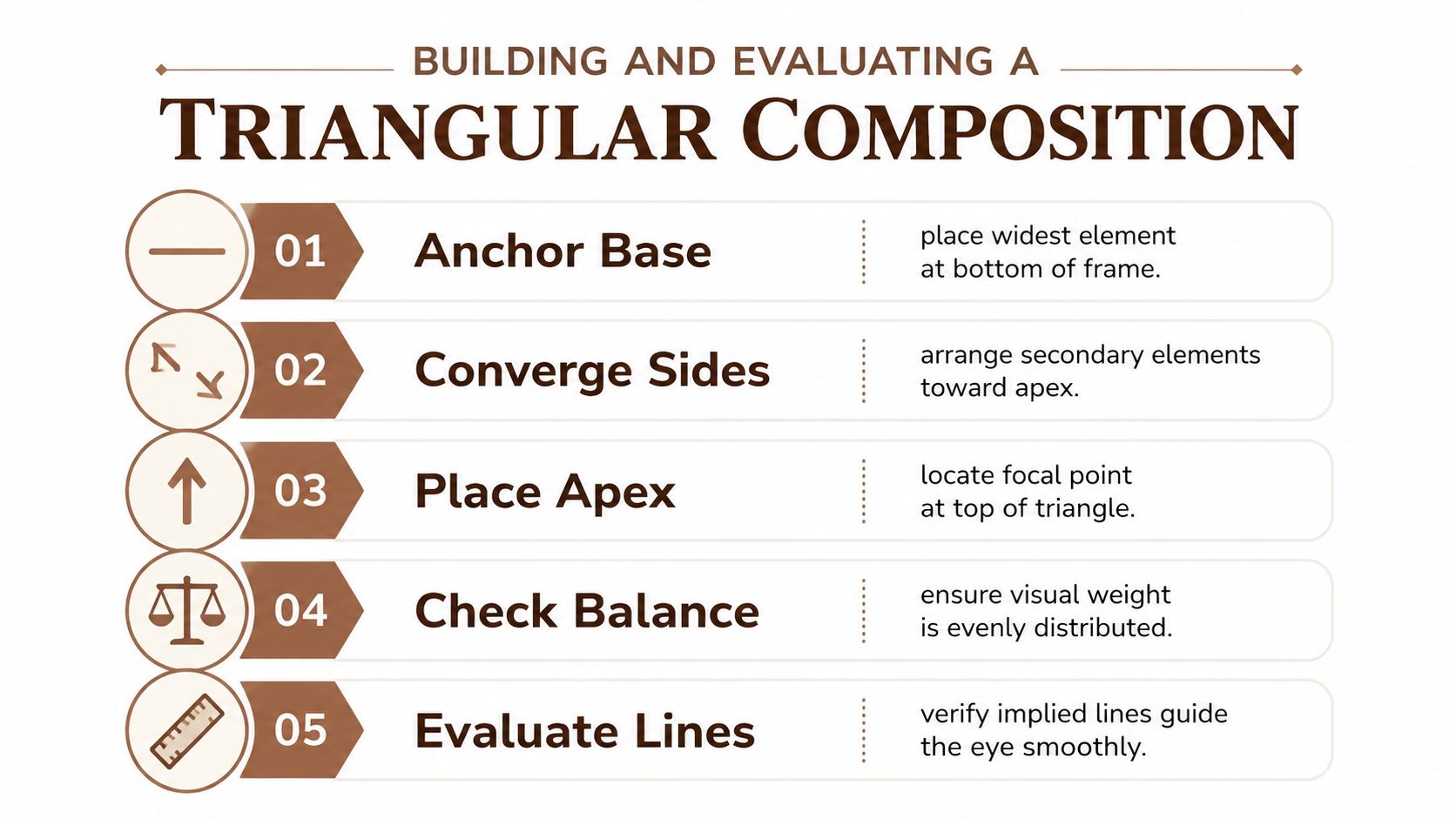
- Anchor the base. Place the widest or heaviest element low in the frame. In a painting, that might be two seated figures. In a photograph, it might be a chair, a table edge, or a pair of shoulders.
- Converge the sides. Let secondary forms rise toward the top point. Use gesture, posture, architecture, or light to lead the eye inward.
- Place the apex. Put the subject of highest importance where the lines meet, or just near that point if you want a softer reading.
- Check balance. Look at how visual weight is spread across the lower half. If one side feels overloaded, add a counterweight rather than removing the whole idea.
- Evaluate the lines. Follow the implied diagonals with your eyes. They should guide the viewer smoothly, not split the image into unrelated parts.
These steps work in drawing, painting, photography, and mixed media because they focus on structure rather than subject matter. You can build a triangle around three figures, a figure and two objects, or a body and two blocks of negative space. The point is not to force a shape into the scene. It's to make the scene readable.
A brief self-check
Ask this first: can I point to the apex in one glance?
Then ask whether the base supports the scene, whether the sides feel connected, and whether the negative space reinforces the triangle instead of breaking it. If the answer to any of those is no, the piece probably needs more editing.
When artists revise this way, they usually improve clarity before they improve style. That's useful because a strong composition can survive a plain palette, a restrained subject, or a limited material set. It gives the work a spine.
Triangular Structure in the ARTIST6 Visual Grammar
ARTIST6 uses triangular structure as part of a broader Renaissance-derived visual grammar. In the work, figures, supports, and atmospheric elements are often arranged so the eye moves from base to apex, then back down through repeated diagonals. Negative space isn't left to chance. It's shaped between forms so the triangle stays legible even when the scene is contemporary.
What can be observed
You can usually see the same hierarchy at work. Lower elements carry more visual mass, middle elements connect, and the upper point receives the strongest emphasis. Gaze lines and gesture help hold the triangle in place. That doesn't mean every image is symmetrical. It means the structure stays readable even when the forms shift.
This matters for collectors because a coherent visual grammar makes an edition feel deliberate. A fixed-edition print with a stable structural language reads as part of an intentional body of work, not as an isolated image that happens to fit a wall. ARTIST6 also keeps a public registry and documented process notes, which lets a collector separate compositional reading from edition facts such as signing, numbering, and closure.
That distinction helps. A composition can be strong even before a collector knows the edition policy. But when the structure is repeated with care across a chapter, the series gains internal consistency. That's often what makes a set hang well together.
The same triangular logic also suits interiors and small museum settings, because it gives a room a visual center without demanding a loud subject. In that sense, it's a formal tool first, and a market signal second. The market only notices the signal because the structure is already doing its job.
Why the Device Still Matters
Triangular composition still matters because it gives artists a way to plan without narrowing the subject. A portrait, a vista, a photo, or a mixed-media piece can all use the same structural logic and still stay distinct. The triangle doesn't dictate theme. It handles attention.
Collectors and curators can use the same language before acquisition or display. They can ask where the apex sits, whether the base is anchored, and whether the implied lines resolve cleanly. Designers and educators can borrow the same grammar for layouts, slides, and wall groupings because it organizes attention without clutter.
When you're deciding whether to use it, keep the questions plain.
- Is the triangle structural, or just decorative?
- Does the apex really matter more than the surrounding forms?
- If you break the triangle on purpose, do the asymmetries still hold together?
- Can non-figurative work use this structure without becoming schematic?
If the answers stay clear, the device is doing real work. If they don't, the composition may be leaning on the idea of a triangle without building one.
If you want a closer look at how Renaissance structure can be carried into contemporary editions, visit ARTIST6 and read the studio's process notes, chapter releases, and registry pages. The work shows how triangular composition, chiaroscuro, and edition discipline can sit in the same visual language.