
Art Prints for Offices: A Buyer’s Practical Guide
You're standing in an empty conference room with a finish schedule, a furniture plan, and one large wall still waiting for a decision. A generic poster would fill it quickly. It wouldn't necessarily support the room, the brand, or the years of use ahead.
That's the procurement problem with art prints for offices. The question isn't only which image looks attractive. It's whether the print has the right scale, material specification, framing system, provenance, and visual relationship to the rest of the workplace.
Table of Contents
- Why Office Art Selection Demands a Serious Approach
- Calibrating Scale and Placement for Commercial Rooms
- Evaluating Archival Standards and Print Longevity
- Framing and Mounting for Shared Environments
- Building Thematic Cohesion Across Office Zones
- Procurement Workflow and Edition Verification
Why Office Art Selection Demands a Serious Approach
An office print is viewed by employees every day, encountered by clients in reception and meeting rooms, cleaned around by facilities teams, and tracked by procurement. That makes the purchase an operational decision as well as a visual one. A selection that works only as decoration leaves scale, material performance, documentation, and future replacement unresolved.
The workplace case is practical. A University of Exeter study found that employees in offices enriched with art and plants were 17% more productive than employees in lean, bare environments. The same research reported that 78% of respondents agreed art helps reduce stress and 64% agreed it increases creativity. These findings do not make every print a productivity device, but they support giving the visual environment more consideration than a last-minute wall covering. (University of Exeter workplace-art findings)
Room function should guide the brief. Reception requires presence without visual noise. A boardroom can carry greater tension and contrast if the work remains subordinate to presentations. Corridors need a sequence, with related works, consistent framing, and edition information that can be maintained across future purchases.
Practical rule: Specify office art as part of the workplace infrastructure, not as an accessory added after furniture and lighting.
The procurement gap
Color palettes, motivational phrases, and broad style categories may start a discussion. They do not settle the questions that determine whether an art program will remain coherent and serviceable:
- Brand alignment: Does the work establish a consistent visual language across departments and sites?
- Wellness intent: Does the imagery support calm, focus, curiosity, or conversation?
- Material life: Are the inks, paper, glazing, and frame suited to shared commercial conditions?
- Operational fit: Can the work be ordered, framed, installed, insured, and replaced without confusion?
- Sustainability review: Can the vendor explain the substrate, production process, and replacement policy?
- Edition permanence: Is the edition documented, and can matching works be sourced if a room or site expands?
A workplace-art survey found that 90% of surveyed organizations display art on their premises, 86% said art is more relevant than ever in today's office environment, and 93% agreed that art makes workplaces more welcoming. (Independent workplace-art survey)
The purchase becomes easier to defend when the record is clear: room, dimensions, image, edition, substrate, glazing, frame, supplier, and replacement terms. That documentation protects the initial selection and gives facilities and procurement teams a workable basis for future decisions.
Calibrating Scale and Placement for Commercial Rooms
A print that commands a gallery wall at home can disappear above a conference table. Commercial rooms often have longer sight lines, higher ceilings, wider furniture, and more visual competition. Scale has to be calculated rather than guessed.
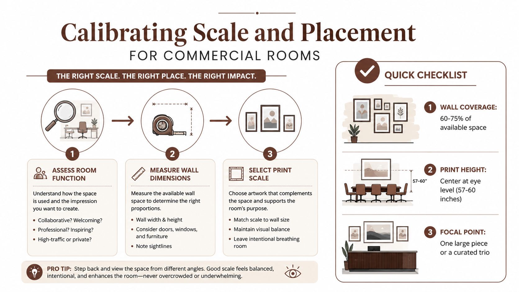
Read the room before selecting the print
Begin with function. A reception wall is usually read while people are standing or approaching. A conference-room wall is read from seated positions. A corridor is read in motion, often obliquely. Those differences affect both image legibility and format.
Measure the uninterrupted wall area, excluding doors, glazing, signage, acoustic panels, and furniture that will remain in place. Then mark the typical sight lines. In a conference room, check the view from the head of the table and from the side chairs. In a private office, assess the seated view behind the desk and the approach from the doorway.
A useful planning target is to let the artwork occupy roughly 60 to 75% of the available visual space in a gallery-wall arrangement. The infographic above uses that range as a practical checklist, but it shouldn't be applied mechanically. A sparse, tonal work may need more physical area than a dense, high-contrast composition to carry the same visual weight.
- Reception: Use one large piece or a deliberate trio. Small isolated prints tend to look provisional against a broad desk and generous wall.
- Conference rooms: Relate the horizontal format to the table. Keep the center of the image near seated eye level, commonly around 57 to 60 inches from the floor, while checking the chair, table, and frame dimensions together.
- Corridors: Repeat a format or rhythm. A sequence of related works is easier to read than a collection of unrelated sizes.
- Collaboration zones: Oversized, modular, and biophilic formats are increasingly used in reception and shared work areas, according to recent commercial-design coverage. (Commercial wall-art design coverage)
Use orientation to support architecture
High ceilings can absorb a vertical composition. Long tables and low credenzas usually benefit from horizontal work. If the wall is wide but interrupted by a screen or architectural feature, a modular arrangement can preserve balance without forcing one oversized frame into an unsuitable position.
Leave breathing room between pieces. A tight cluster can work in a reception gallery, but it often becomes cluttered in an office where signage, screens, and people already occupy the field of view. For a more deliberate arrangement, review principles of triangular composition in art and test the layout at full scale with paper templates before drilling.
Evaluating Archival Standards and Print Longevity
The word archival has little value without a material specification behind it. A corporate buyer should ask what the ink is, what the paper contains, how the print was tested, and whether the stated lifespan applies to the finished object or only to one component.
A properly specified archival pigment print commonly uses pigment-based inks, a 100% cotton or cotton-rag substrate, acid-free construction, and no optical brightening agents. Pigment systems are chosen for stability, but the paper and display conditions matter just as much. A strong ink on an unsuitable substrate isn't a complete archival solution.
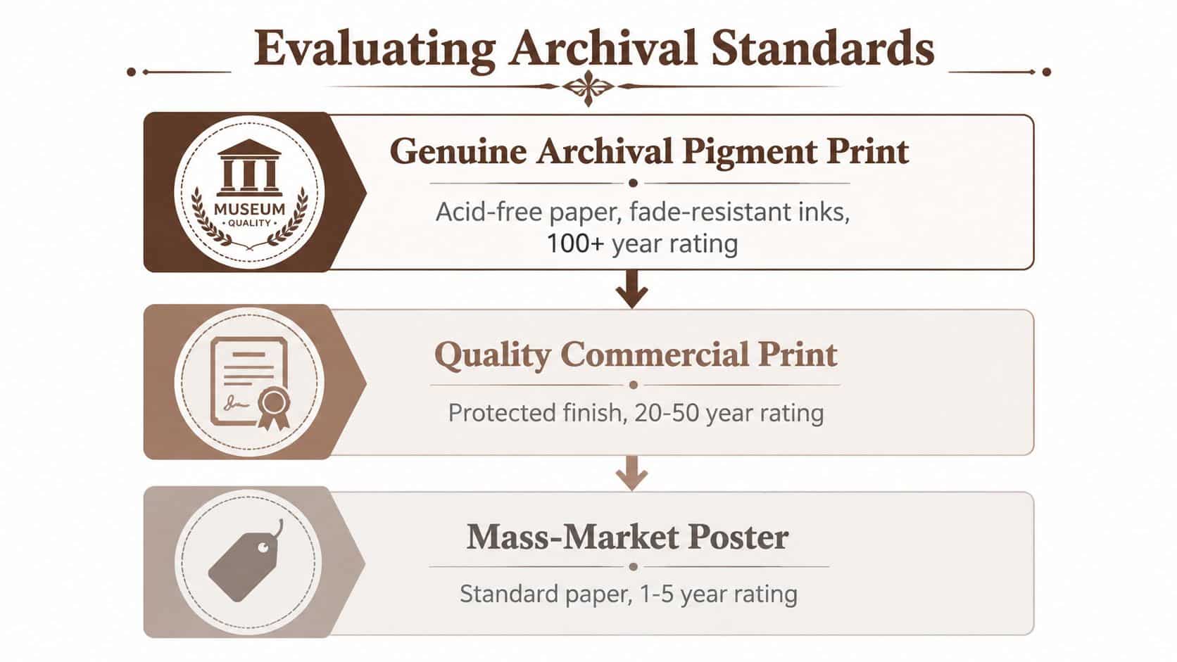
Ask for measurable paper criteria
Archival paper standards associated with ISO 9706 and ANSI/NISO Z39.48 require a pH of 7.5 or higher, an alkaline reserve of at least 2%, and lignin content below 1%. These thresholds give procurement teams language they can place in a specification instead of relying on the word “fine art.” (Archival inkjet-paper standards)
The absence of optical brightening agents also matters. Brighteners can make paper appear whiter under some lighting, but they aren't the same as long-term conservation quality. Ask whether the paper is cotton rag, whether it's acid-free, and whether the manufacturer publishes a technical sheet.
The print itself should be described as a pigment print rather than an unspecified inkjet poster. Buyers comparing production partners may also find it useful to review practical information about inkjet manufacturing, particularly when assessing how a vendor translates a digital file into a repeatable physical edition.
Understand how longevity claims are tested
Print permanence is typically assessed through accelerated aging. Samples are exposed to intense light, high humidity, and heat to simulate extended natural aging in compressed timeframes. Lab-based estimates can be tied to organizations such as the Image Permanence Institute, which makes the claim more specific than a general promise of durability. (Conservation testing and archival pigment prints)
Office conditions still require judgment. Bright glazing, direct sun, cleaning chemicals, climate fluctuations, and poor ventilation can shorten the useful life of any framed work. Specify suitable glazing, avoid placing valuable prints where sunlight falls directly for long periods, and retain the material documentation with the purchase record.
Framing and Mounting for Shared Environments
A frame in a private home mainly protects the print from dust and light. In an office, it also has to withstand routine cleaning, accidental contact, security concerns, and constant visual exposure. The frame is part of the specification, not a finishing touch.
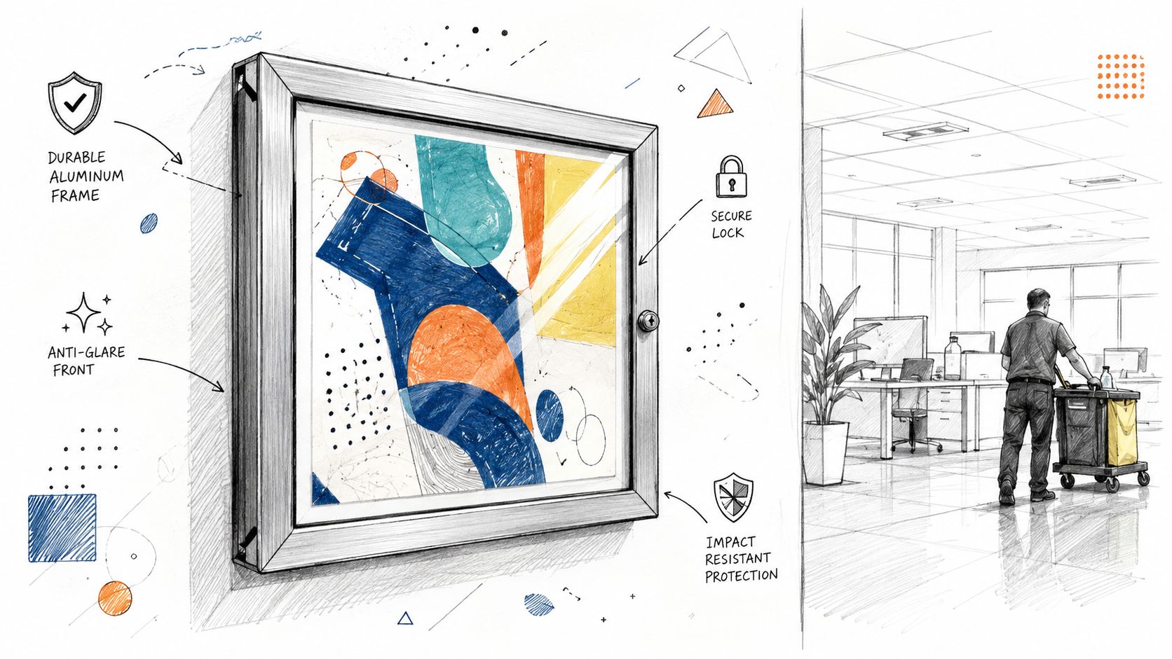
Choose the frame as a working component
Hardwood frames offer warmth and can support a more established, residentially refined environment. Aluminum profiles are lighter, dimensionally stable, and well suited to modern offices where repeated frames need a consistent line. Composite frames can reduce weight and cost, but the finish and joinery should be checked before specifying them across a portfolio.
The profile should relate to the architecture. A narrow black or dark bronze frame can recede around a dense contemporary composition. A wider wood profile adds weight and should be used deliberately, especially in rooms with substantial furniture. Standardizing the outside profile across several rooms can create coherence without forcing every image into the same visual treatment.
Matting changes the perceived scale. A generous neutral mat gives a small or finely detailed image more authority. A narrow mat makes the artwork feel denser and more immediate. For contemporary figurative work, a float mount can create separation between the paper and backing, but the framer must control dust, movement, and edge exposure.
Control glare, weight, and access
Museum glass can reduce reflections in brightly lit reception areas, which helps visitors see the image instead of the ceiling grid. It costs more and still requires careful lighting. Acrylic is lighter and more forgiving in weight-sensitive installations, though it can scratch and may attract static during cleaning.
Public-facing areas deserve security hardware. Use tamper-resistant fixings where appropriate, select hanging systems rated for the finished weight, and coordinate with the wall type. Plasterboard, concrete, brick, and acoustic systems each require different anchors. Keep installation records, including fixing type and location, so facilities teams don't have to guess during future maintenance.
A basic hanging reference can help teams prepare the wall correctly. These wall décor hanging tips for homeowners are written for domestic settings, but the measuring principles are still useful before a commercial installer adapts them to site requirements.
The following visual reference shows how a finished display can sit within a professional setting.
Building Thematic Cohesion Across Office Zones
Fragmentation is the common failure. Reception receives a large-format piece, the boardroom gets an unrelated abstract, and the corridor becomes a sequence of leftover purchases. Each piece may be attractive, yet the workplace has no visual grammar.
A coherent program doesn't require identical images or a single narrow style. It requires shared decisions about palette, composition, subject, and finish. A chapter-based collection is useful because it gives each zone a distinct role while keeping the whole installation legible.
Build a visual grammar
Choose the elements that should repeat. A palette anchored in bronze, umber, ochre, oxblood, lapis, and gold can move between warm reception lighting, cooler meeting rooms, and daylight corridors without becoming dependent on one exact wall color. The palette should guide selection, not dictate every surface.
Composition can provide continuity. Figurative work, triangular structures, and controlled contrast can connect pieces even when their subjects differ. Chiaroscuro is a defined method using strong contrasts between light and shadow to create dimensionality, drama, and volume. Historically, chiaroscuro drawing could apply shadow first with ink, pen, or wash on colored paper, then add highlights with white chalk or gouache. (Definition and history of chiaroscuro)
That distinction matters. “Moody” is a style cue. Chiaroscuro describes an actual approach to modeling form. A buyer can therefore ask whether a collection shares a method rather than asking whether the images feel similar.
Organize the workplace as chapters
Reception can introduce the central subject. Corridors can extend it through related studies. Collaboration spaces can hold more open or energetic compositions, while private offices can carry quieter works from the same visual world. The relationship should be apparent without requiring employees or visitors to read a wall label.
Renaissance-derived methods can support this approach without turning the office into a historical reconstruction. Contemporary work may use the logic of Renaissance-inspired art while addressing present-day subjects, spaces, and identities.
A durable collection answers two questions at once. Does each piece work alone, and does the group make sense when seen across the building?
Trend-led decor has a place in flexible environments, especially where digital or reconfigurable systems are appropriate. It becomes less convincing when replacement is frequent, provenance is unclear, and every expansion requires starting over. A long-life collection with fixed editions and documented origins gives a corporate buyer more control over continuity, auditability, and future placement.
Procurement Workflow and Edition Verification
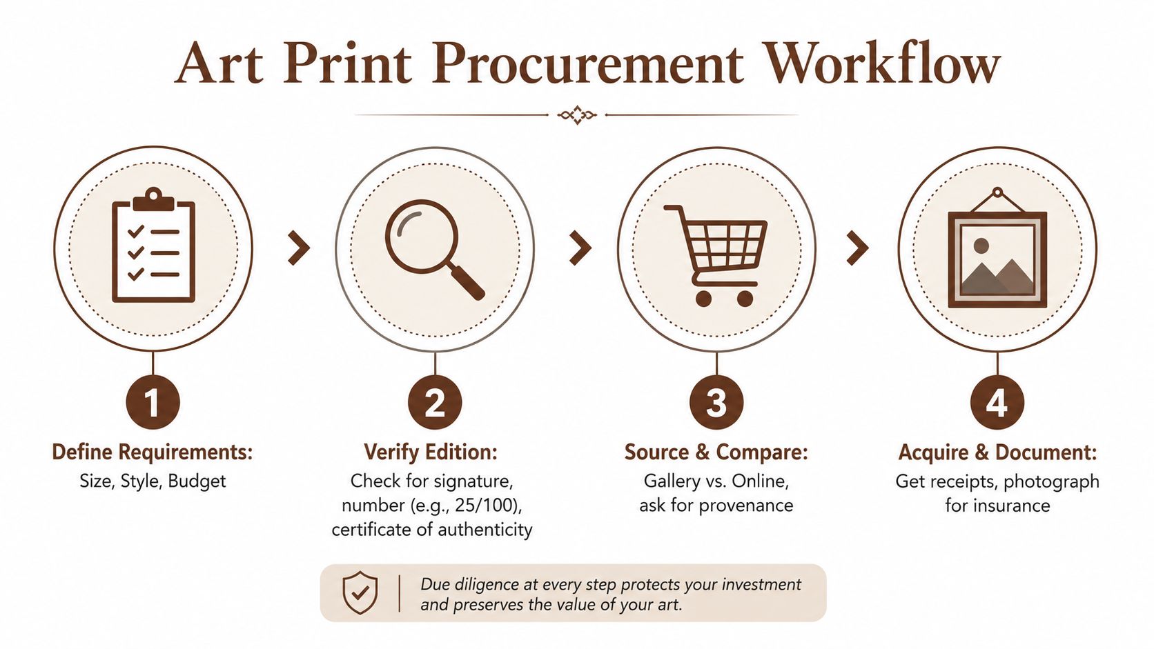
A corporate art purchase should start with a written specification, not a preferred image. Record the room, wall dimensions, viewing distance, palette, intended mood, print substrate, glazing, frame profile, budget, and installation conditions. This keeps visual decisions tied to the physical and operational requirements of the site.
Verify the edition
For limited work, request the edition size, signature method, numbering convention, seal or mark, certificate of authenticity, and any public registry. A fixed edition gives the buyer a defined object rather than an open-ended reproduction. Confirm whether the artist permits reprints, smaller reissues, posters, or digital-file releases after the edition closes.
Review the price schedule with the same care. Defined increases at stated sell-through thresholds make the commercial terms visible before purchase and help multi-site buyers plan phased acquisition without relying on informal assurances.
Process documentation also matters for brand-conscious organizations. Ask the studio to identify the tools, materials, printer, paper, post-processing, and signing process. Where digital tools or AI-assisted workflows form part of production, the buyer needs a clear record of how the physical edition was made.
For a practical reference on the difference between an open poster and a signed, numbered edition, review this guide to limited-edition prints that are signed and numbered.
Plan the rollout
Allow time for print production, proofing where applicable, framing, delivery, site access, installation, and documentation. For multiple offices, approve one finished sample before authorizing the full order. Photograph each installed work, record its location and edition details, retain invoices and certificates, and add the information to the organization's asset register.
Use this checklist:
- Define requirements: Record dimensions, style, palette, budget, substrate, frame, and site conditions.
- Check provenance: Match the signature, edition number, certificate, seal, and public registry.
- Compare suppliers: Ask for material sheets, production details, lead times, and installation responsibilities.
- Document the asset: Keep receipts, photographs, edition records, and care instructions together.
Workplace art has broad acceptance, which makes disciplined procurement important. Artwork is regarded as an established part of office design, but acceptance does not resolve questions of provenance, durability, or future placement.
Before approving the order, verify the edition size, registry entry, documentation, and price schedule. Confirm that the physical specification matches the approved sample and that installation records will be retained with the organization's asset register.
ARTIST6 produces contemporary Renaissance fine art as limited archival prints, organized into coherent chapters for offices and shared commercial spaces. Review the available editions and documented materials at ARTIST6, then contact the studio to discuss scale, framing, and a phased workplace installation.