
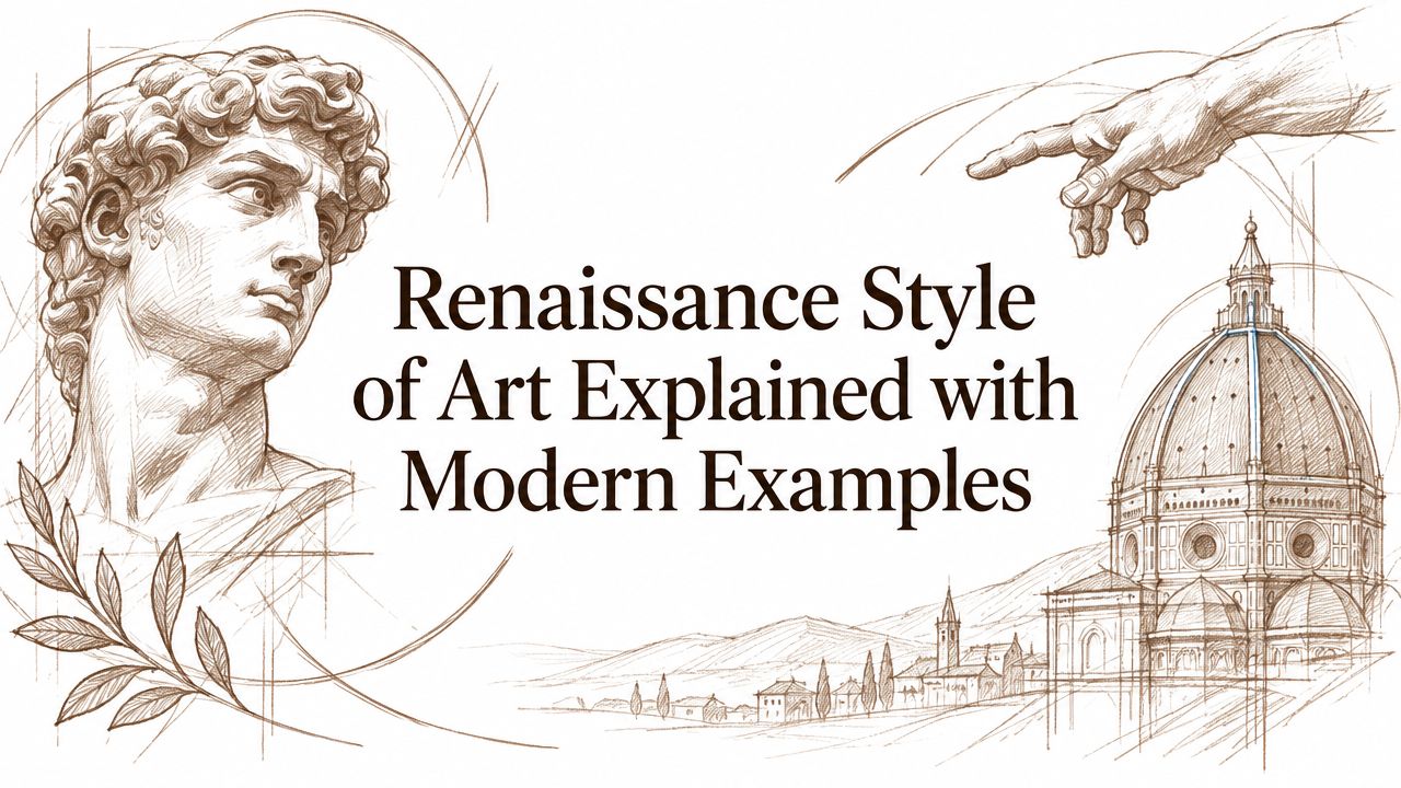
Renaissance Style of Art Explained with Modern Examples
I stood in front of a small oil painting and watched the cheekbone turn out of shadow. The face didn't look outlined. It looked built.
That is why the renaissance style of art still matters. It trains the eye to notice how volume, proportion, and light hold a figure together, and it gives collectors a practical way to tell careful work from decorative imitation. The style is not just a period label in a museum wall text, it is a disciplined visual grammar that still shapes how we read paintings, prints, sculpture, and even contemporary editions.
Core idea: Renaissance art makes seeing visible. It turns light, anatomy, and space into structure.
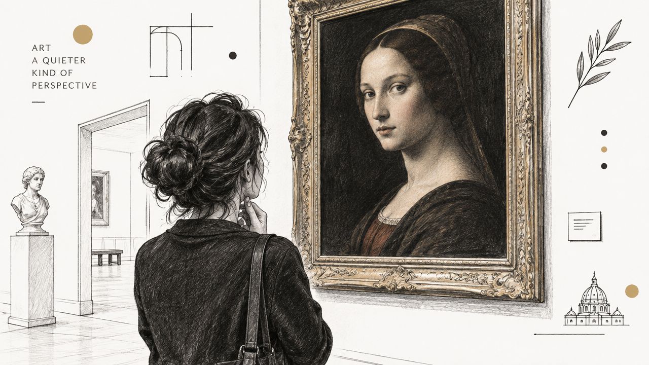
Table of Contents
- Introduction Why Renaissance Style Still Teaches Us to See
- What the Renaissance Style of Art Actually Means
- How the Renaissance Style Developed Over Two Centuries
- Hallmarks That Make Renaissance Style Recognizable
- Materials Techniques and Studio Practice Behind the Look
- Renaissance Style in Contemporary Practice and the ARTIST6 Approach
- How Collectors Identify and Evaluate Renaissance Inspired Works
Introduction Why Renaissance Style Still Teaches Us to See
A viewer often notices Renaissance art first through the face. The eyes meet you, but the work is happening around them. A highlighted cheek, a softened temple, and a shadow that wraps the jaw together create the sense that the figure occupies space, not just paint.
That is the quiet power of Renaissance style of art. It depends less on ornament than on measured choices, a body placed with intention, a light source that behaves consistently, and a scene ordered enough for the eye to move through it without confusion. The movement is broadly placed between about 1400 and 1600 CE, with the peak in Italy in the 1490s to the 1520s. Leonardo da Vinci, Michelangelo, and Raphael stand at the center of the High Renaissance Britannica on Renaissance art.
The timeline matters because it shows the style as concentrated, not endless. The widest frame spans roughly two centuries, but the most influential interval was much shorter, and that compression helps explain why these works still guide painting, sculpture, and architecture. A style this disciplined leaves a clear structure behind.
Collectors and students often begin with subject matter and stop too early. The stronger habit is to read the construction under the subject matter. Who holds the triangle of the composition together. Where does the light land. Does the body sit in space with confidence, or is it only wearing a historical costume.
That is the collector's test. Renaissance-derived work should show the logic of composition, palette, edition discipline, and provenance, not just familiar imagery. Genuine craftsmanship carries its structure in the open. Pastiche borrows the look, but the order underneath usually gives it away.
The answer usually arrives in the details, and it arrives slowly.
What the Renaissance Style of Art Actually Means
A painter working in Renaissance style begins with humanism, classical revival, and a careful turn toward naturalism. The shift is easier to see in the studio than in theory. The figure no longer sits as a flat emblem on a gold field. It has weight, proportion, and a place in shared space.
The style is not a bag of decorative motifs. It is a visual grammar. Classical columns may appear in a painting, but they do not make the style by themselves. A religious scene can still belong to the Renaissance if the bodies, the light, and the space follow that new discipline of looking.
Human subject, classical memory
Humanism moved the person back to the center of visual thinking. Classical revival gave artists ancient models of balance and order to study, not copy blindly. The result often feels measured and serious, because the work keeps one eye on Greece and Rome while keeping the other on living bodies in the present tense.
Naturalism changed representation at the level of method. Britannica notes that Renaissance naturalism appears in earlier European art, but it does not dominate until the 15th century History.com on Renaissance art. That gradual change matters. The style was built through long experimentation, not a single leap.
Practical rule: If a work borrows arches, drapery, or a saintly face but does not build believable space or bodily presence, it is using Renaissance costume, not Renaissance grammar.
Collectors often confuse the style with “old-master” atmosphere. That is too loose. Renaissance art organizes the human figure, the surrounding space, and the viewer's attention so the scene reads clearly. For a collector, that clarity becomes a decision tool. Composition should hold, palette should feel disciplined, edition discipline should be evident where relevant, and provenance should support the work's claims. Pastiche borrows the look. Genuine craftsmanship carries the order underneath.
How the Renaissance Style Developed Over Two Centuries
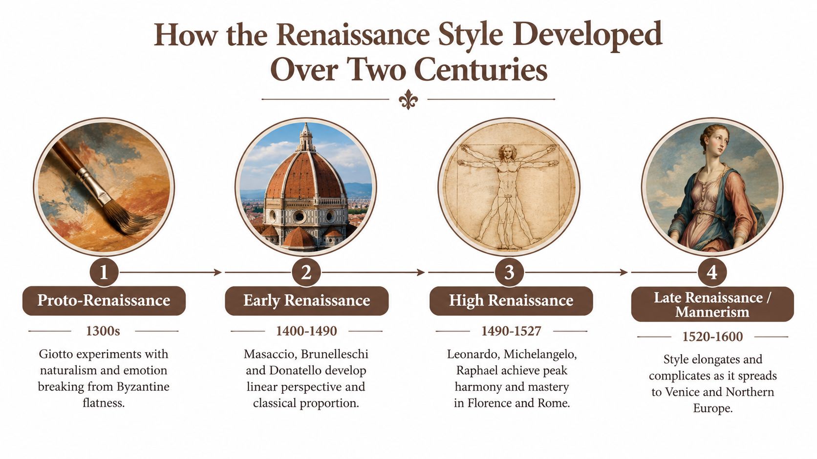
The style did not arrive in one finished form. It emerged in Italy through a long apprenticeship in seeing, first in the late 13th and early 14th centuries, then in a proto-Renaissance phase often dated from roughly 1280 to 1400 before the language matured around 1400. That slow build matters for collectors, because it shows the Renaissance as a method that had to be learned, tested, and refined.
From experiment to peak
The early phases worked through naturalism, perspective, and more convincing bodies. The eye could see the shift before the label settled. By the High Renaissance, the visual language had become steady enough to carry large, balanced compositions and ambitious figures. Britannica places that peak in Italy between the 1490s and the 1520s, with 1527, the Sack of Rome, marking the turning point that ended the High Renaissance as a unified phase Britannica on Renaissance art.
For collectors, that distinction helps separate a broad historical movement from its most concentrated center of achievement. The Renaissance spans about two centuries, but its most integrated expression is much tighter. That is why a work can borrow Renaissance elements and still feel detached from the period's real discipline. The surface may quote the style. The structure has to carry it.
The familiar names anchor that peak for a reason. Leonardo da Vinci lived from 1452 to 1519, Michelangelo from 1475 to 1564, and Raphael from 1483 to 1520. Their work became a reference point because structure, anatomy, and light are held together with unusual control.
That long development also explains a common confusion. People expect something called “Renaissance” to look uniform. It does not. It matures, tightens, and then shifts. What stays consistent is the effort to make representation coherent in the body, the space, and the light.
Hallmarks That Make Renaissance Style Recognizable
A collector often notices the whole before the parts. The scene feels settled, then the eye starts reading how it was made. In Renaissance-derived work, that calm comes from geometry, controlled space, and tonal discipline. A crowded image still feels ordered if the figures are placed with intention and the light behaves consistently.
The structure the eye follows
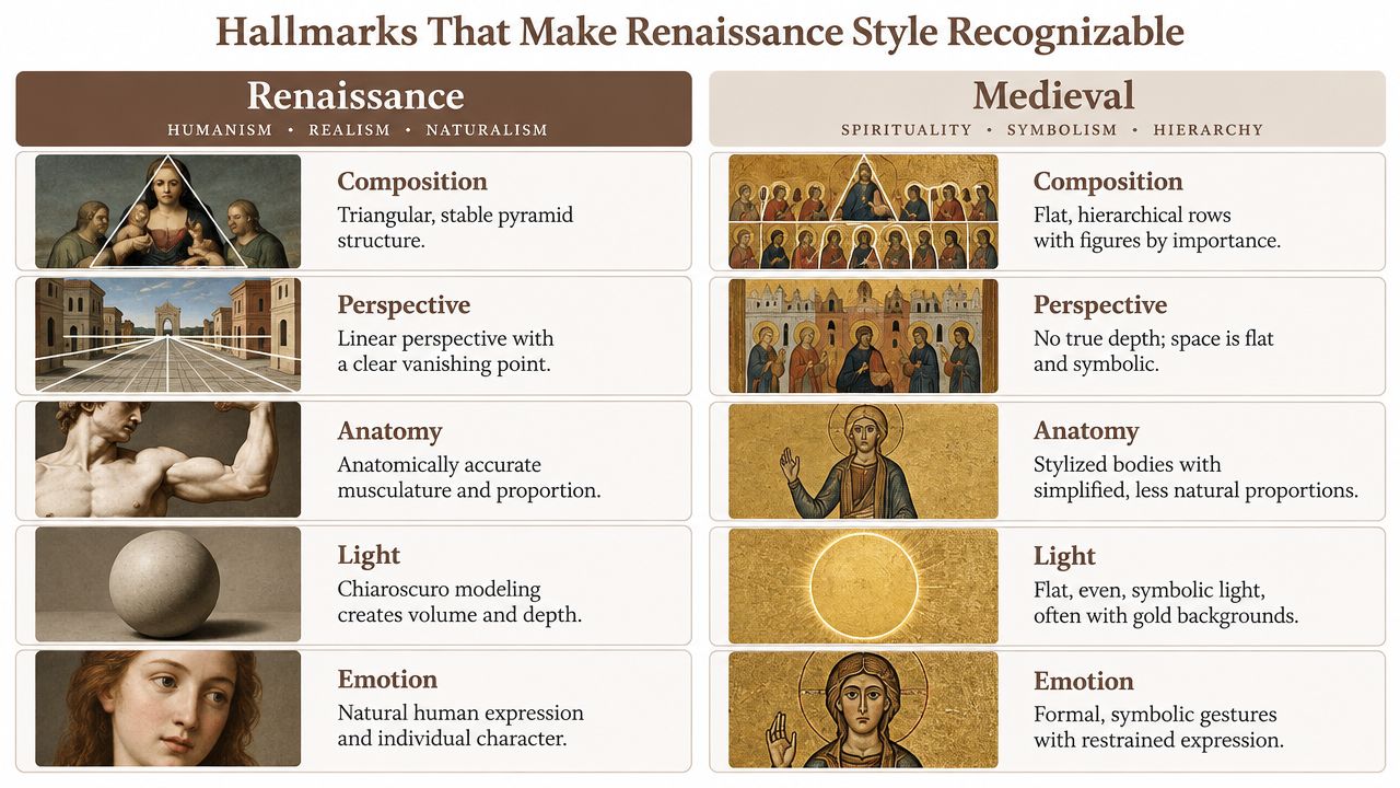
One common device is hierarchical triangular composition. If you learn how triangular composition in art steadies a figural scene, the logic becomes easier to spot. Bodies and gestures are arranged around a central triangle, so the eye has a clear route from apex to base National Gallery of Art PDF. In a crowded grouping, that structure reduces confusion. It tells the viewer where to begin and where to rest.
Perspective and anatomy carry that structure. The figure is not stuck onto the surface. It sits inside a measured space, often supported by foreshortening, adjusted scale, and the placement of heads and hands. A Renaissance image feels convincing when the figures seem to share the same air.
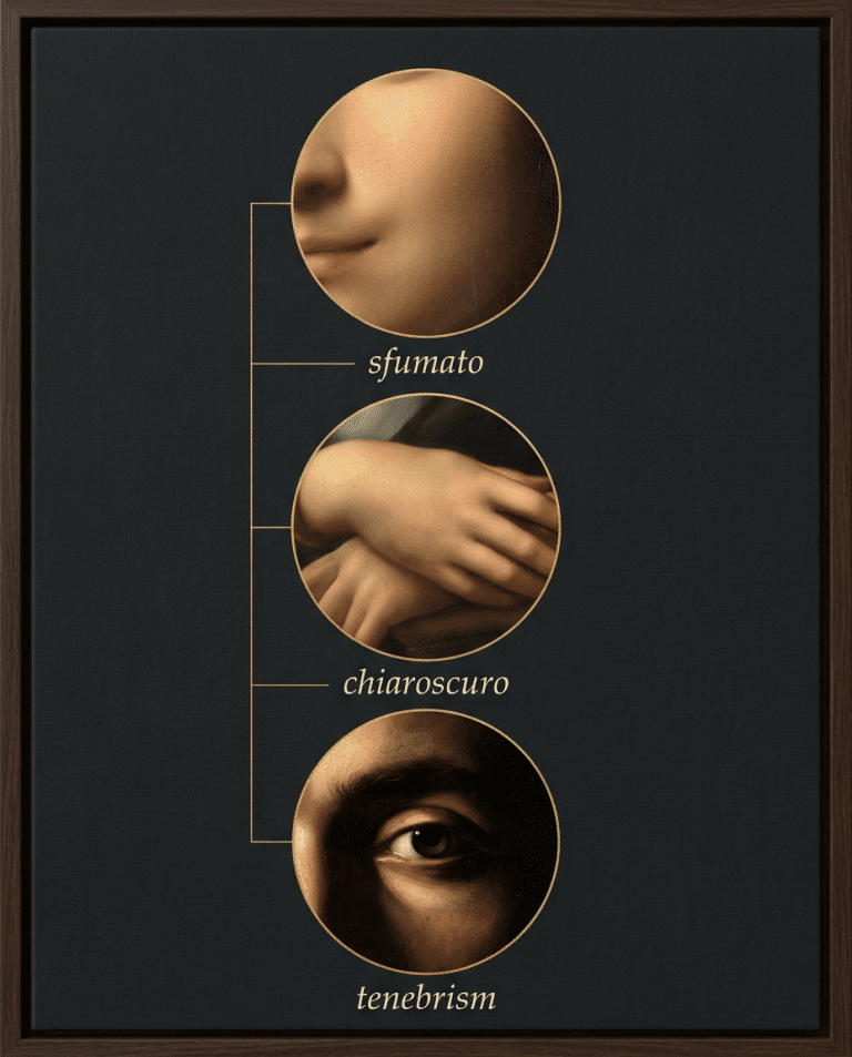
| Light and Shadow Techniques Compared | Purpose | Visual Effect |
|---|---|---|
| Chiaroscuro | Model three-dimensional form through tonal gradation | Volume, depth, and narrative focus strengthen |
| Sfumato | Soften transitions between tones and edges | Forms feel gently atmospheric |
| Tenebrism | Push strong contrast for drama | Figures emerge sharply from darkness |
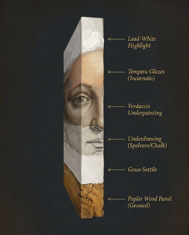
Renaissance chiaroscuro is precise, not just general contrast. It builds form through highlight, halftone, core shadow, and reflected light, so the body reads as volume rather than outline Christopher Tyler on chiaroscuro. That controlled movement of tone is why a cheek, hand, or fold of cloth can feel constructed instead of traced.
The palette matters too. Renaissance painters often worked with earth pigments such as umber and ochre, plus select mineral and organic pigments, so value relationships carried much of the expressive burden. Rather than relying on saturated color alone, the painter uses restrained materials to let structure do the work.
For collectors, these marks function like a decision frame. Look for a balanced triangle, a believable body, a clear light source, and a palette that stays composed. When those elements hold together, the work reads as Renaissance-derived craftsmanship. If the surface borrows the look but the structure wavers, it is closer to pastiche than to the visual grammar it imitates.
Materials Techniques and Studio Practice Behind the Look
A sheet can begin as a quiet ground and still teach the eye how to read form. Renaissance drawing often started with a middle-tone ground, then moved toward light with white gouache and toward dark with ink, bodycolour, or watercolour, so the paper itself became part of the tonal structure Wikipedia on chiaroscuro. The result is built, not merely traced.
From ground to print
The palette was specific, not decorative. Pigment analysis identifies earth colors in yellow, brown, red, and golden shades, plus azurite, natural ultramarine from lapis lazuli, and lead-based yellows Bonizzoni et al. pigment study. Those materials give collectors a concrete way to read surface decisions. When color is restrained, value, edge, and structure have to do the main work.
Printmaking carried the same discipline into relief work. The chiaroscuro woodcut appeared in Italy around 1516, and it used two or more woodblocks inked in different hues LACMA on chiaroscuro woodcut. The logic is parallel to painting: separate tones carry volume, not outline alone. For a clearer comparison of method and effect, see how Renaissance chiaroscuro, tenebrism and sfumato differ in purpose and effect.
Collector’s note: Ask what carries the tone, paper, ink, or layered paint. If that answer stays vague, the work may be borrowing Renaissance appearance without the working method behind it.
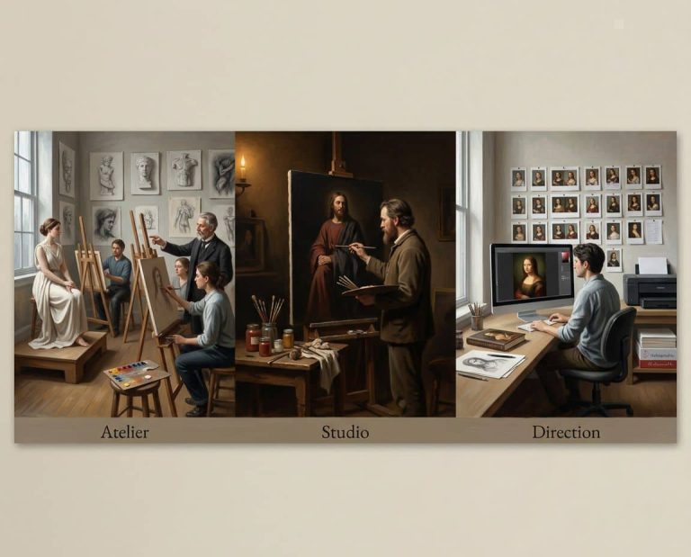
That distinction still matters in contemporary practice. A studio may use digital generation, hand-finishing, archival paper, and print production, but the central question is whether the workflow is declared, the materials stay consistent, and the edition is controlled. In that setting, certificate of authenticity details are part of the object’s record. A credible fine-art print certificate should include the artist’s name, title, date made, print date, edition number and total edition size, print dimensions, paper and ink/process details, printer name if different from the artist, a unique COA number, and the artist’s original signature PRINTS.org on COAs.
A collector can use the same visual grammar as a checklist. Look for a stable composition, a clear light source, disciplined materials, and documentation that matches the object. When those elements hold together, the work reads as Renaissance-derived craftsmanship. When they slip, the surface may still look old-master, but the structure reveals pastiche.
Renaissance Style in Contemporary Practice and the ARTIST6 Approach
The contemporary question is not whether Renaissance visual grammar still exists. It does. The harder question is how to tell whether a modern work uses that grammar with discipline or only borrows the look. That matters more now because visible process, human authorship, and transparency are part of what collectors inspect.
AI-assisted work sits inside that question. Used carefully, it can function as a tool, closer to a camera than a substitute for judgment. The deciding factors are not the software label alone. They are process transparency, edition control, and material finish. A collector looking at a Renaissance-derived contemporary print should want to know who curated the output, how it was hand-finished, what paper was used, and how the edition is governed.
What to ask in the room
A serious Renaissance-inspired contemporary work should answer a few basic questions without evasion.
- Who made the final decisions? The artist’s hand, eye, or selection should be visible in the result.
- What is the edition policy? Fixed editions matter more than open-ended scarcity language.
- How is provenance recorded? A public registry, signed numbering, and a certificate help the record hold.
- What carries the style? Triangular composition, controlled light, and figurative coherence should still be doing real work.
One example is ARTIST6, a single-artist studio that releases signed, numbered archival prints in limited editions of 6, with chapter-based bodies of work and a permanent public registry. Its practice centers on bronze, umber, ochre, oxblood, lapis, and gold, and it treats process disclosure as part of the object’s record, not as a side note.
That approach makes sense in a market where collectors are moving toward handmade, textured, figurative work, and where the dividing line is often not old versus new, but transparent versus opaque. Renaissance-derived work survives in contemporary practice when the grammar is intact and the making is legible.
How Collectors Identify and Evaluate Renaissance Inspired Works
A collector can usually tell the difference between genuine craft and pastiche by slowing down. Start with structure. If the composition falls apart without the decorative surface, it isn’t carrying Renaissance logic. If the bodies feel stiff, the spatial depth is vague, and the light doesn’t model form, the reference is probably only cosmetic.
A practical comparison lens
Use this short list before buying:
- Triangular structure: Does the eye move through a stable arrangement, or does the scene drift?
- Value control: Are the highlights, halftones, and shadows doing the building work?
- Anatomical coherence: Do hands, shoulders, and heads sit naturally in space?
- Palette restraint: Are the tones disciplined, or is color covering weak drawing?
- Provenance signals: Are there signed numbered editions, seals, certificates, and a public registry?
Edition discipline matters because it shapes trust. A fixed edition with visible numbering and a permanent registry gives collectors a record that still exists after sell-out. A changed edition, a quiet reissue, or a vague print run doesn’t offer the same clarity. The work linked through Renaissance-inspired art is one contemporary example of how collectors can inspect that clarity in practice.
A clean edition trail tells you as much as the image does.
Price should follow the same logic. If the artist publishes a step schedule and keeps it stable, the collector can understand where the work sits in the run. If the pricing shifts without explanation, that’s a signal to slow down.
Look at the piece, then look at the paper trail. Renaissance style rewards patience, and good collecting does too.
If you want contemporary Renaissance-derived work with clear edition rules, documented process, and a public registry, visit ARTIST6 and review the current original Renaissance fine art releases. You’ll see how the grammar of light, composition, and material finish carries into present-day prints without losing discipline.