
Chiaroscuro Art Technique Explained for Modern Studio
A gallery room can feel quiet until one face catches the light. The cheek turns, the eye recedes, and the surrounding darkness begins to describe the figure as firmly as the paint itself. This is the first encounter with the chiaroscuro art technique, a visual grammar in which light doesn't merely illuminate form. It builds it.
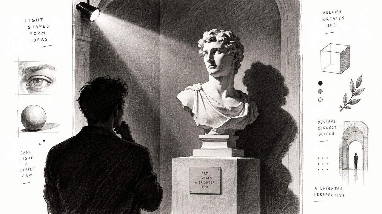
Table of Contents
- Introduction Where Light Becomes Form
- What Chiaroscuro Means and How It Works
- A Brief History From Toned Paper to Baroque Drama
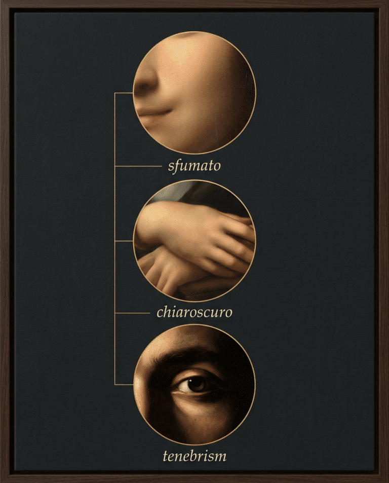
- Chiaroscuro Tenebrism and Sfumato Compared
- The Visual Grammar Behind Convincing Light
- Applying Chiaroscuro in Contemporary Studio and Print Practice
- Seeing Chiaroscuro Clearly and Collecting With Confidence
Introduction Where Light Becomes Form
Look closely at a well-structured chiaroscuro image and the darkness won't seem empty. It carries the weight of the room, sets the distance between objects, and gives the lit areas their force. A forehead, shoulder, or hand appears solid because the artist has arranged a sequence of values, not because the outline is especially strong.
That distinction matters in contemporary figurative work. A modern subject can borrow the logic of Renaissance painting without becoming a historical imitation. The same organization of light can shape a portrait, a still life, a symbolic figure, or an archival print. The subject changes. The underlying grammar remains legible.
The word comes from the Italian roots chiaro, meaning light, and scuro, meaning dark. Art historians use the term for a method of modeling figures and objects through graded relationships between illumination and shadow, so that a flat surface suggests three-dimensional form. The Art Story's definition of chiaroscuro describes this movement from surface to volume clearly.
This guide approaches chiaroscuro as more than dramatic lighting. It begins with the mechanics of highlights, midtones, core shadows, and reflected light. It then follows the technique through Renaissance drawing, Leonardo da Vinci, Caravaggio, Rembrandt, and printmaking. From there, the focus turns to the distinctions between chiaroscuro, tenebrism, and sfumato, before moving into the practical decisions that make light convincing.
For collectors, designers, and artists, the benefit is direct. You can learn to ask whether the light has a consistent source, whether the values support the focal point, and whether the edges describe depth. In an archival print, you can also see whether those decisions survive translation from studio image to paper.
Chiaroscuro rewards slow looking. It asks you to read light as structure.
What Chiaroscuro Means and How It Works
A simple analogy helps. Place a plaster sphere beneath one window. The side facing the window receives the strongest light. The surface turns gradually through middle values, then enters the darker side of the form. A small amount of bounced light may remain inside the shadow. Even without an outline, the sphere reads as round because the values follow its surface.
That is the core of chiaroscuro. The artist uses highlights, midtones, shadows, and reflected light to make a flat image behave like a solid object. The effect depends on gradation as much as opposition. A dark area beside a bright area can create drama, but the transition between them must also describe the direction and curvature of the form.
The four working values
The highlight is the area most directly reached by the light. It doesn't need to be large. A restrained highlight on the bridge of a nose or the rim of a vessel can establish the light's position.
The midtone carries the turning of the surface. It links illumination to shadow and often does more work than the brightest passage. Without midtones, a figure may appear cut from paper.
The core shadow marks the deeper part of the form away from the light. It defines volume, but it shouldn't become a featureless black shape unless the intended style calls for it.
Reflected light enters the shadow from nearby surfaces. It keeps the dark side from collapsing completely, while remaining subordinate to the light family. The technical explanation of chiaroscuro at Learn Art emphasizes this arrangement of shadows, midtones, and highlights as a means of modeling volume rather than adding contrast for its own sake.
Value hierarchy and edge control
A convincing image has a value hierarchy. Some passages must dominate, while others support them. If every area receives equal brightness and equal contrast, the eye has no clear route through the composition.
Edges work alongside value. A sharp edge can clarify a turn or bring a feature forward. A softened edge can allow one plane to recede. A lost edge lets a form merge with the surrounding dark, which can make the visible portion feel more present.
Practical rule: Strong contrast should explain the form before it intensifies the mood.
This is why not every dark, cinematic image is chiaroscuro. The chiaroscuro art technique depends on an intentional relationship between light direction and volume. Drama may result, but drama alone isn't the definition.
A Brief History From Toned Paper to Baroque Drama
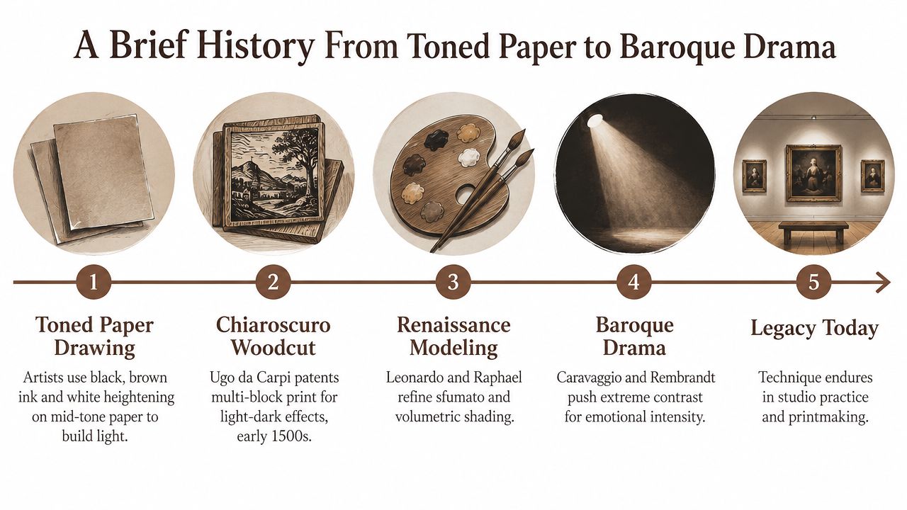
Chiaroscuro has a history in both image-making and image reproduction. In drawing, the method originally referred to work made on toned paper, where the middle value of the sheet became part of the structure. Artists could establish darker passages with black or brown, then raise the light with white highlights. Silverpoint, ink, charcoal, and gouache all supported this approach.
The process begins with a useful reversal of ordinary drawing habits. Instead of treating the paper as empty space and adding only dark marks, the artist starts from an existing middle tone. Darkness is added where the form turns away. Light is added where it catches the surface. The image develops in both directions.
Printmakers also adapted the principle. Jackson's Art's account of chiaroscuro techniques notes that Ugo da Carpi patented the chiaroscuro woodcut in 1516, using two to four woodblocks to build tonal effects. Each block could carry a different part of the value structure, allowing the printed image to suggest modeling through layered impressions.
Leonardo and the Renaissance consolidation
The technique reached a major turning point in the late fifteenth century. Britannica's history of chiaroscuro identifies Leonardo da Vinci's Adoration of the Magi, dated 1481, as an early benchmark and states that Leonardo brought the method to full potential in European painting.
Leonardo's importance lies in the way light becomes a modeling system. Form doesn't depend only on contour. It emerges through gradual transitions, carefully observed shifts, and the controlled relationship between illuminated and shaded planes. Renaissance artists refined this approach alongside related methods such as sfumato, using light to give bodies weight and atmosphere.
The technique therefore belongs to a larger Renaissance interest in observation, volume, and the behavior of bodies in space. It wasn't a decorative effect added after the drawing. It shaped the drawing's logic.
From Renaissance modeling to Baroque drama
By the late seventeenth century, the term had expanded. Britannica describes it as a descriptor for any painting, drawing, or print built on extensive gradations of light and darkness. That shift matters because chiaroscuro moved from a specialized modeling method toward a broader visual category across media.
The lineage continues through Caravaggio and Rembrandt. The National Gallery identifies Leonardo and Caravaggio as signature practitioners and describes chiaroscuro as a means of using light and dark to create volume and dramatic emphasis. The National Gallery glossary entry on chiaroscuro places the mature technique within the Renaissance and Baroque periods.
Leonardo da Vinci, Caravaggio, and Rembrandt worked across a span of roughly 250 years, from Leonardo's birth in 1452 to Rembrandt's death in 1669, as recorded in the National Gallery reference. Their approaches differ, but the continuity is clear. Chiaroscuro remained a durable language for realism, volume, attention, and emotional intensity.
For a broader look at the period that formed this visual grammar, see this guide to Renaissance style in art.
Chiaroscuro Tenebrism and Sfumato Compared
Readers often use these terms interchangeably because they all involve light, shadow, and transitions. They describe related practices, but they don't produce the same visual result.
Chiaroscuro organizes light and dark to model form. It can be subtle or forceful. The essential question is whether the values describe the turning of a body or object.
Tenebrism pushes the image toward very low overall illumination. A narrow beam isolates the principal figures while much of the surrounding space remains in deep shadow. The method is closely associated with Caravaggio, whose religious paintings use restricted illumination and stark shadow fields to give figures an illusionistic force. An academic summary of this strategy describes figures appearing before the viewer “with the force of illusion” through the arrangement of light and shadow. The discussion of chiaroscuro and Caravaggio's example examines this concentrated form of contrast.
Sfumato relies on soft, smoky transitions. It avoids a hard boundary between one value and the next, allowing facial features and atmospheric spaces to dissolve gently. Leonardo is the central historical reference. Sfumato can support chiaroscuro, but the terms name different aspects of the image.
How to Tell Chiaroscuro Tenebrism and Sfumato Apart
| Technique | Purpose | Light and Edge | Visual Result |
|---|---|---|---|
| Chiaroscuro | Model volume and organize attention | Graded values with edges adjusted to form | Solid, dimensional bodies with a clear light structure |
| Tenebrism | Intensify drama and isolate figures | Very low ambient light, narrow illumination, strong shadow fields | A concentrated scene with forceful separation |
| Sfumato | Soften transitions and create atmospheric unity | Smoky shifts and softened edges | Forms that emerge gradually, often with a hazy quality |
Contrast is not the whole method
Strong contrast alone doesn’t make an image chiaroscuro. If the bright and dark areas have no spatial logic, the result may look graphic rather than volumetric. If every edge is equally hard, the image can flatten because the viewer receives no information about which forms sit forward and which recede.
This distinction also matters outside fine art. Contemporary fashion imagery has repurposed chiaroscuro as a recognizable visual cue, including a 2026 Balenciaga campaign that publicly cited the technique as inspiration, as discussed in Draw Paint Academy’s chiaroscuro guide. The reference can be effective, but a moody atmosphere isn’t enough. Intentional light direction and value hierarchy must still carry the image.
A useful test is to reduce the image to a simple value study. If the light still explains the cheek, sleeve, vessel, or architectural plane, chiaroscuro is doing structural work. If the image depends only on darkness for attitude, it has moved toward an effect.
The Visual Grammar Behind Convincing Light
The chiaroscuro art technique becomes reliable when the artist makes a small set of decisions early and keeps them consistent. The decisions are less about adding darkness than about assigning roles to each value.
Begin with the light source. A window, lamp, candle, or imagined beam can work, but the direction must remain stable. If the forehead receives light from the left while the cast shadow falls as though the light came from the right, the form loses credibility.
One dominant light source creates a readable world.
This doesn’t mean every surface has the same brightness. It means the shadows agree about where the light is coming from. The cast shadow under a chin, the dark plane beneath a sleeve, and the shadow behind a vessel should all belong to the same spatial system.
A hierarchy the eye can follow
The brightest light should have a reason to exist. It may identify a face, hand, fabric fold, or symbolic object. Around it, organize quieter lights and deeper darks so the eye doesn’t scatter across the frame.
A practical value study can use graphite, charcoal, or diluted ink before paint enters the process. Mark the principal light family first. Then place the middle values that turn the form. Reserve the deepest darks for areas that need to anchor space or separate overlapping shapes.
The dark isn’t automatically the focal point. Sometimes the focal area is a modest light surrounded by a field of quiet shadow. The hierarchy depends on the subject and the composition.
Edges describe distance
Hard, soft, and lost edges have different jobs. A crisp edge can bring a hand or profile forward. A softened contour can make a shoulder turn away. A lost edge can let dark hair merge with the background, leaving the lit cheek to carry the identity of the face.
This is why edge control must be planned with value. A hard outline around every form works against the illusion of light because it gives each object the same visual authority.
The guide to triangular composition in art is useful here because triangular structures can gather figures and light into a stable route for the eye. The triangle isn’t a formula to apply mechanically. It can act as a quiet scaffold, helping the principal light move through the subject and supporting forms.
Materials and layering
Transparent darks and opaque lights behave differently. A transparent dark wash can deepen a shadow while allowing the underlying warmth of the surface to remain visible. Thicker opaque paint can establish a light plane or reserve a highlight.
On toned paper, this logic is direct. The paper supplies the middle value. Charcoal or brown ink builds the dark family. White gouache or another opaque light material raises the illuminated passages. In painting, a warm underlayer can serve a similar role, but the artist must still protect the value hierarchy.
Reflected light should keep a shadow alive, not turn it into a second light source.
Cast shadows also need attention. They anchor objects to the floor or table and describe the space around them. A floating figure often has a value problem below it, not a drawing problem.
Applying Chiaroscuro in Contemporary Studio and Print Practice
A contemporary subject doesn’t need historical clothing or an old-master setting to carry chiaroscuro. It needs a deliberate light structure. Begin with the question, what should the light reveal, and what should it leave unresolved? That decision gives the image a purpose beyond generic mood.
Use a single warm source when the subject needs concentrated volume. Bronze, umber, ochre, oxblood, lapis, and gold can support a Renaissance-derived palette without turning the work into a replica. The colors should serve the value structure. A deep oxblood passage can remain part of the shadow family, while a restrained gold note can function as a light accent.
From studio decisions to archival paper
Archival printing changes the workflow because the image must survive reproduction. Details that appear distinct on a luminous screen may merge when printed. A soft shadow can lose separation, and a small highlight can become too assertive if the tonal structure wasn’t checked before production.
Make a monochrome proof. Inspect the darkest connected areas. Look for a clear focal passage, a believable light direction, and enough middle value to turn the form. Documentation also matters. Recording the tools, materials, iterations, printer, and paper gives the finished edition a traceable process rather than an unexplained surface.
Photographic documentation should preserve the same logic. A useful guide to product photography can help with controlled lighting, consistent framing, and accurate presentation when an artwork is being documented for a collector or online registry. The goal isn’t spectacle. It’s to show the work without introducing a competing light pattern.
ARTIST6 applies this approach through chapter-based contemporary Renaissance fine art, releasing limited, signed, and numbered archival prints in editions of 6, with twelve-piece chapter releases and a permanent public registry. Its visual grammar draws on chiaroscuro, figurative composition, triangular structures, and the palette described above. The studio’s fine art print shop presents available editions within that framework.
Avoiding the look of generic mood lighting
A dark background isn’t enough. Ask whether the shadow describes a form, anchors a figure, or protects the focal light. If it only makes the image feel serious, the contrast may be decorative rather than structural.
Keep the subject contemporary through its pose, setting, clothing, or symbolic details. Keep the historical reference in the method. The result can belong to the present while still carrying the discipline of Renaissance modeling and Baroque emphasis.
Seeing Chiaroscuro Clearly and Collecting With Confidence
A strong chiaroscuro image gives you several things to test without requiring specialist knowledge.
- Light direction: Check whether the highlights and cast shadows agree about the position of the source.
- Value hierarchy: Notice where the eye lands first, then follow the sequence into quieter passages.
- Tonal transition: Look for middle values that turn the form instead of jumping from white to black.
- Edge variation: Identify which contours are sharp, softened, or allowed to disappear.
- Spatial support: See whether cast shadows and overlapping forms anchor the subject.
- Reproduction quality: In a print, inspect whether the darkest areas retain separation and whether highlights still feel intentional.
- Edition clarity: For a limited work, look for stated edition rules, numbering, signatures, and a record that can be checked.
The method has endured because it solves a basic visual problem. A flat surface must suggest weight, depth, and presence. Renaissance artists developed the language further, Baroque painters pushed its drama, and contemporary studios continue to adapt its structure for new subjects and print processes.
Collectors can look beyond atmosphere. Ask what the darkness is doing. Ask whether the light reveals construction, directs attention, and gives the subject room to exist. Those questions make the difference between recognizing a fashionable look and understanding a controlled visual method.
A chapter-based archival edition can extend that understanding across related works. When the same discipline appears in different subjects, the collection begins to read as a sustained language rather than a group of isolated images.
ARTIST6 offers limited, signed, and numbered archival prints organized into chapter-based series, with chiaroscuro, triangular composition, and Renaissance-derived methods applied to contemporary subjects. Visit ARTIST6 to review available fine art editions.