
Renaissance Inspired Art: A Collector’s Guide
The first time I stood in front of a contemporary panel lit like a Caravaggio, the room went quiet. The figure held together because the shadows were disciplined, not because the surface was glossy. That's the difference between renaissance inspired art as a method and renaissance styling as decoration.
Table of Contents
- Defining Renaissance Inspired Art in Contemporary Practice
- The Visual Devices That Define the Method
- Historical Roots and the Economics of Patronage
- How Contemporary Studios Adapt Classical Methods
- Evaluating Archival Quality and Edition Integrity
- Chapter-Based Collecting and Thematic Coherence
- A Practical Checklist for Verifying Limited Editions
Defining Renaissance Inspired Art in Contemporary Practice
A convincing contemporary work in this mode doesn't copy an old painting. It borrows a way of building an image. The figure is given weight. The background recedes. The light feels chosen, not sprayed across the surface.

What the inheritance actually looks like
The core inheritance is practical. Chiaroscuro gives form. A pyramidal composition stabilizes the scene. A restrained palette keeps the image from breaking apart.
In the studio, that means the subject can be contemporary and still feel rooted in the Renaissance. A woman in modern dress, a botanical study, a symbolic portrait, or a saint-like figure all work if the structure is sound. The visual language comes first. The costume comes later.
This is why the best contemporary examples feel serious rather than nostalgic. They don't chase period detail for its own sake. They use Renaissance technique to slow the eye and give the subject gravity.
How to tell technique from surface
Surface borrowing is easy. A gold wash, an old frame, a dramatic face turned three-quarters, all of that can look “Renaissance” for a moment. Technique is harder to fake.
Practical rule: if the light, value structure, and composition don't support one another, the work is only wearing the costume.
The Metropolitan Museum of Art's Renaissance Revival frame from 1860–80 shows how long this language has been reinterpreted, while the Suermondt-Ludwig Museum's building, designed in Renaissance Revival style and built between 1884 and 1888, shows the aesthetic was still being actively reworked more than 300 years after the original period (Metropolitan Museum of Art). That long afterlife matters. It means contemporary artists aren't picking up a dead language. They're speaking a language that has stayed alive through use.
The Visual Devices That Define the Method
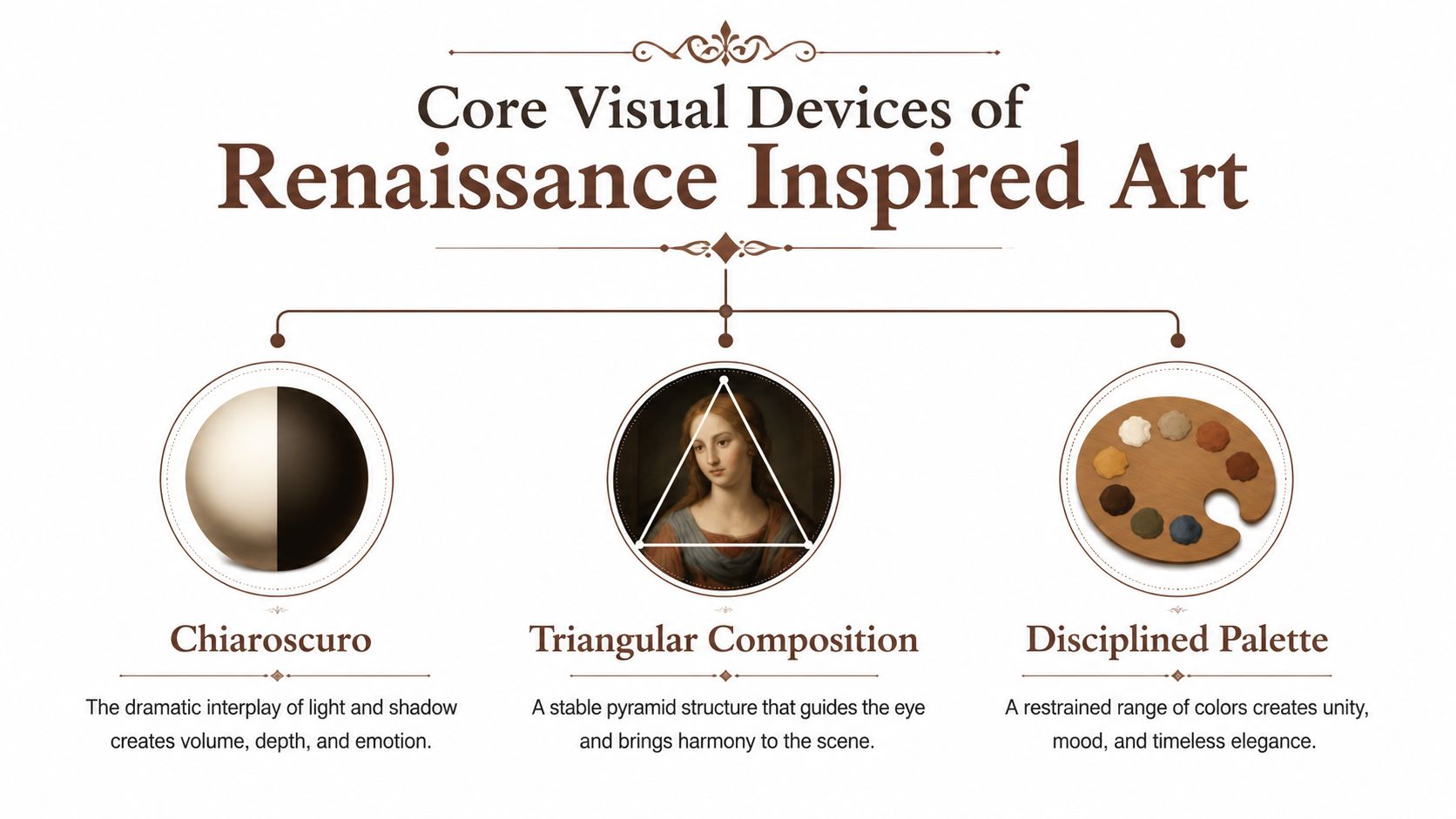
A finished Renaissance-inspired image usually resolves through three devices, each doing a different job. Chiaroscuro gives volume, triangular composition gives stability, and a disciplined palette holds the whole scene together. When they work in concert, the image feels settled even if the subject carries tension.
Chiaroscuro without confusion
In studio terms, chiaroscuro is the first place technical discipline shows. It works best when the scene is reduced to a few tonal zones, highlight, light, midtone, core shadow, and cast shadow. That kind of separation keeps the form readable at small scale and pulls the eye toward the strongest contrast point (Britannica).
Over-blending is the common failure. It softens the edges that tell you where a face turns, where a hand lifts, or where cloth folds back on itself. A single dominant light source helps. So does limiting ambient fill. The shadows then behave the same way across the composition, and the figure holds together under inspection.
The practical value of the device is easier to see than the label itself. For a closer look at the craft side of chiaroscuro, tenebrism, and sfumato, the question is how value structure supports volume instead of just creating drama. Renaissance painters used these effects to make bodies feel three-dimensional, and later writing tied the term closely to Baroque painting as well (Wikipedia). The method matters more than the category.
Triangles hold the scene together
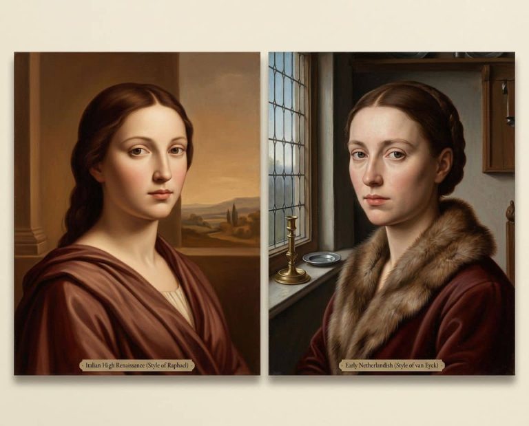
High Renaissance painters often arranged figures into a triangle, and Raphael is repeatedly cited for that device in art-history teaching materials (LibreTexts)). The reason is plain. A triangle gives the eye a stable route through the image.
In contemporary work, that shape can be obvious or nearly hidden. Three figures, a seated body balanced by a standing gesture, or a single portrait built from shoulder line, gaze, and hand placement can all produce the same effect. The point is not geometry for its own sake. It is compositional discipline that keeps the subject from drifting.
The palette does the quiet work
The palette most often associated with this approach leans on bronze, umber, ochre, oxblood, lapis, and gold. Those hues sit together easily and keep chroma under control. They also let light read cleanly against darkness.
That restraint matters in reproduction, too. If every area of the canvas competes for attention, the eye stops moving with purpose. A narrow palette preserves hierarchy and makes the highlights feel earned.
Historical Roots and the Economics of Patronage
The historical record matters because the Renaissance was also a market. A dataset of more than 300 paintings by over 100 artists, covering primary commissions from 1285 to 1550, shows that painting prices began rising quickly in the 1420s and kept climbing through the rest of the 15th century. The useful reading is clear. Demand, competition, and price pressure shaped production as much as prestige did, as shown in the LUISS research PDF.
Patronage was never the whole picture
That history maps cleanly onto contemporary studio practice. Artists worked for buyers with choices, and those buyers compared quality, turnaround, and cost. Reputation still mattered, but so did availability and how convincingly the work matched the brief.
The same logic appears in limited editions. A studio that states an edition size before release, then closes it without reopening the run, is behaving in a way collectors can evaluate. Scarcity has always supported value. What changes is the format, not the mechanism.
A later revival of the style shows why the market side never disappeared. The Metropolitan Museum of Art's Renaissance Revival frame, 1860–80, and the Suermondt-Ludwig Museum's Renaissance Revival building, 1884 to 1888, show that the look kept returning in design and collecting long after the original period ended (Metropolitan Museum of Art). Revival was part of the tradition, not an afterthought.
Why this still matters to collectors
Collectors read these cues quickly. A studio that understands patronage usually publishes clear edition rules, keeps presentation consistent, and avoids pretending that scarcity happened by chance.
Price structure matters for the same reason. If a work is offered in known quantities and not reissued later, it can be judged as an edition rather than a loose digital offering. The object still has to stand on its own, but the surrounding policy shapes trust before the sale.
Public provenance records are now part of that trust as well. Clear edition notes, named materials, printer information, and a traceable ownership history make later verification easier, especially when AI-assisted workflows are involved. In a market where collectors compare paper, finish, and release policy closely, clarity is part of the work.
The lesson is practical. Renaissance-inspired production was never only about lineage. It was also about how work moved, who could buy it, and what structure made ownership credible.
How Contemporary Studios Adapt Classical Methods
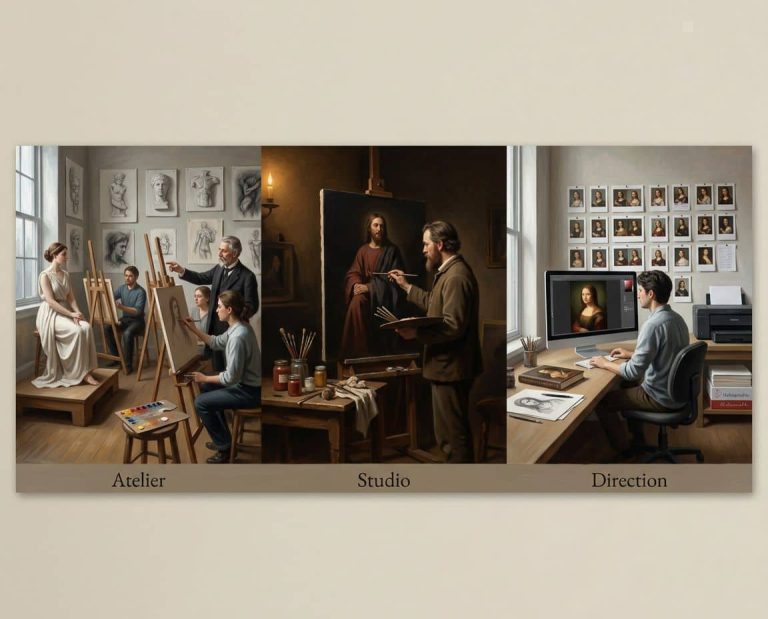
A studio can use AI and still work with discipline. The tool does not choose the final image. The studio sets the brief, edits the outputs, and decides what survives.
The workflow that holds up
A practical workflow starts with a narrow concept, then a controlled prompt. Figure type, light direction, palette, and composition all need limits before generation begins. AI then produces options, not conclusions.
The next step is editing with a painter's eye. Strong structure matters more than effects. Hands that read poorly, faces that drift, shadows that contradict the space, and decorative clutter all get cut. What remains is usually refined by hand in digital painting or drawing layers, because the final image still has to hold together as a picture, not just as a prompt result.
The last stage is the object. For a collectible print, the paper, pigment, and edition policy need to be settled before the sale. If the edition can be reissued later, the buyer is not collecting a fixed edition, only a shifting file relationship. One studio that publishes its process, materials, and edition rules this way is ARTIST6, which treats AI as one part of a hand-finished workflow.
Transparency isn't optional anymore
Collector confidence depends on knowing what was done, and by whom. Tool disclosure, iteration history, printer details, paper choice, and finishing notes reduce confusion when provenance gets checked later. Public provenance registries help here because they keep the record visible after the work has sold.
Collectors also need a clear way to judge scarcity. A work made from digital generation can still be a disciplined edition, but only if the studio fixes its release policy and keeps that policy traceable. A loose digital offering with vague quantity language belongs in a different category.
That gap is where buyers need the most help. The art market still leans heavily on broad trend writing, while practical guidance for AI-assisted but hand-finished work remains thinner, especially on how collectors weigh edition integrity against image origin (Milan Art Institute commentary). Clear records do more than support resale. They make the work easier to verify from the start.
Evaluating Archival Quality and Edition Integrity
Archival quality starts with the support. For fine art prints, a properly produced pigment print on 100% cotton, acid-free paper is the relevant benchmark, and it's commonly rated for 200+ years under museum-standard display conditions (Raphael Macek journal). That benchmark exists because solid pigments and acid-free substrates slow color shift and substrate degradation.
What to verify before buying
Look for the full chain, not just the image. A clean edition should make the paper, pigment, seal, signature, and registry easy to confirm. If one of those pieces is vague, the whole claim weakens.
- Paper and pigment: Ask for 100% cotton, acid-free stock, and pigment-based printing.
- Edition closure: Confirm that the edition is fixed and that reprints, smaller reissues, posters, and file releases are excluded.
- Marking: Check for signature, numbering, and a studio seal or emboss where that's part of the policy.
- Registry: A public edition registry should stay visible after sell-out, so provenance doesn't disappear with the last sale.
- Display readiness: Framing materials should meet archival enclosure standards, especially when the work will hang in strong light.
For enclosure materials, ISO 18916 specifies the Photographic Activity Test for items such as paper, tissue, cardboard, mat board, plastics, adhesives, inks, paints, labels, and tape used in storage, display, and transport for photographic works (ISO 18916). That standard doesn't replace judgment, but it gives collectors and framers a useful reference point.
A compact comparison
| Standard | Specification | Why It Matters |
|---|---|---|
| Archival fine art print | Pigment on 100% cotton, acid-free paper | Slows degradation and supports long-term display |
| Enclosure materials | Materials meeting ISO 18916 Photographic Activity Test context | Helps reduce harmful chemical interaction in framing and storage |
| Edition policy | Fixed run, no reprints, no smaller reissues, no posters, no digital-file releases | Protects scarcity and collector confidence |
| Registry | Public, persistent record after sell-out | Preserves provenance visibility |
| Market guidance | Buyer resources that explain authentication and AI-art checks | Helps verify claims before purchase |
If you want a secondary reference for digital-image review, how to spot AI generated art is useful as a general check, though it should never replace direct studio documentation or print-level verification.
Chapter-Based Collecting and Thematic Coherence
Fragmented collecting tends to produce rooms with no center of gravity. One piece is painterly, another is theatrical, another is decorative. The wall can start to feel like a search history.
Why chapter-based releases hang better
A chapter-based model solves that. A body of work released as a unified set gives the collector a visual grammar that holds together across multiple pieces. The pieces can still vary, but they share light logic, palette, and subject pressure.
That matters in Renaissance-inspired work because the style depends on internal consistency. A single strong portrait can look good anywhere. A chapter of related works can shape a room. The difference shows up when the works are hung side by side. Cohesion comes from shared structure, not from matching frames.
Transparent pricing also belongs here. A published schedule with step increases at defined sell-through points removes guesswork. The buyer knows the terms. The studio knows the terms. No one is improvising after the fact.
The public collection pages at ARTIST6 Renaissance art collections reflect that logic through chapter-based releases, including ANIMA MUNDI, LUMEN SYLVARUM, and THE HORTUS EDITIONS. Each chapter has its own internal continuity, which makes it easier to collect deliberately instead of opportunistically.
Buy chapters when you want a wall to read as one thought.
What works and what doesn’t
Works with a chapter structure:
- Unified hanging: The works speak to one another without needing explanation.
- Long-term curation: Additions feel intentional, not random.
- Cleaner provenance: The series identity stays legible over time.
Doesn’t work as well:
- Trend buying: Pieces arrive from different moods and don’t settle into a room.
- Mixed visual languages: One image leans baroque, another leans graphic, and the collection loses coherence.
- Opaque release habits: Surprise reissues make early purchases harder to defend.
The strongest collections are usually built slowly. They don’t need to be loud. They need to stay together.
A Practical Checklist for Verifying Limited Editions
A limited edition should be easy to verify before money changes hands. If the seller makes that hard, the buyer should slow down. The object may still be good, but the paperwork is doing too little.

The essentials
Use the same checklist every time. It keeps the conversation focused.
- Artist’s signature. The signature should be present, legible, and consistent with the studio’s stated policy.
- Edition numbering. A number like 42/150 should match the declared edition size and closed-run rules.
- Certificate of authenticity. The certificate should identify the work, not just the studio name.
- Archival paper. Ask what stock was used and whether it is pigment printed on cotton, acid-free paper.
- Studio seal or emboss. A physical mark adds another layer of verification when paired with a registry entry.
The collector should also check the public registry after purchase, then keep the invoice, certificate, and any packing documentation together. That paper trail matters more as years pass.
Display conditions matter too
Even a well-made print can be undermined by poor display. UV exposure, unstable humidity, and bargain framing materials can shorten the life of the object. Archival enclosure standards are part of the purchase, not an afterthought.
A studio that closes editions cleanly and keeps a permanent public record gives the collector something durable. That record doesn’t disappear when the work sells out. It stays visible, which is exactly what provenance needs.
For a signed, numbered edition with clear closure rules, see ARTIST6’s limited edition print policy. It’s the kind of documentation collectors should expect before they commit.
ARTIST6 produces contemporary Renaissance fine art as limited, signed, and numbered archival prints, with chapter-based releases, transparent edition rules, and a permanent public registry. If you want work that treats technique, provenance, and object quality as part of the same decision, visit ARTIST6 and review the current editions, process notes, and chapter structure before you buy.